the brand
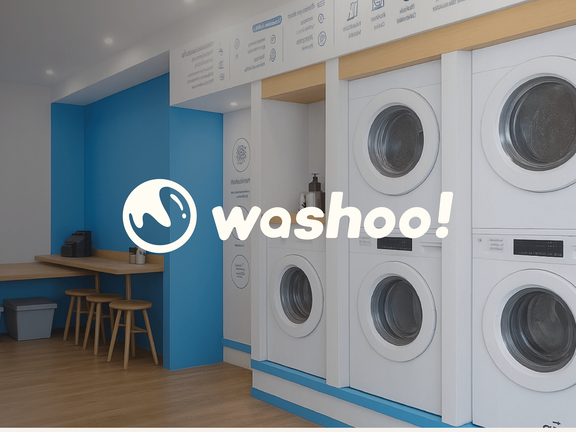
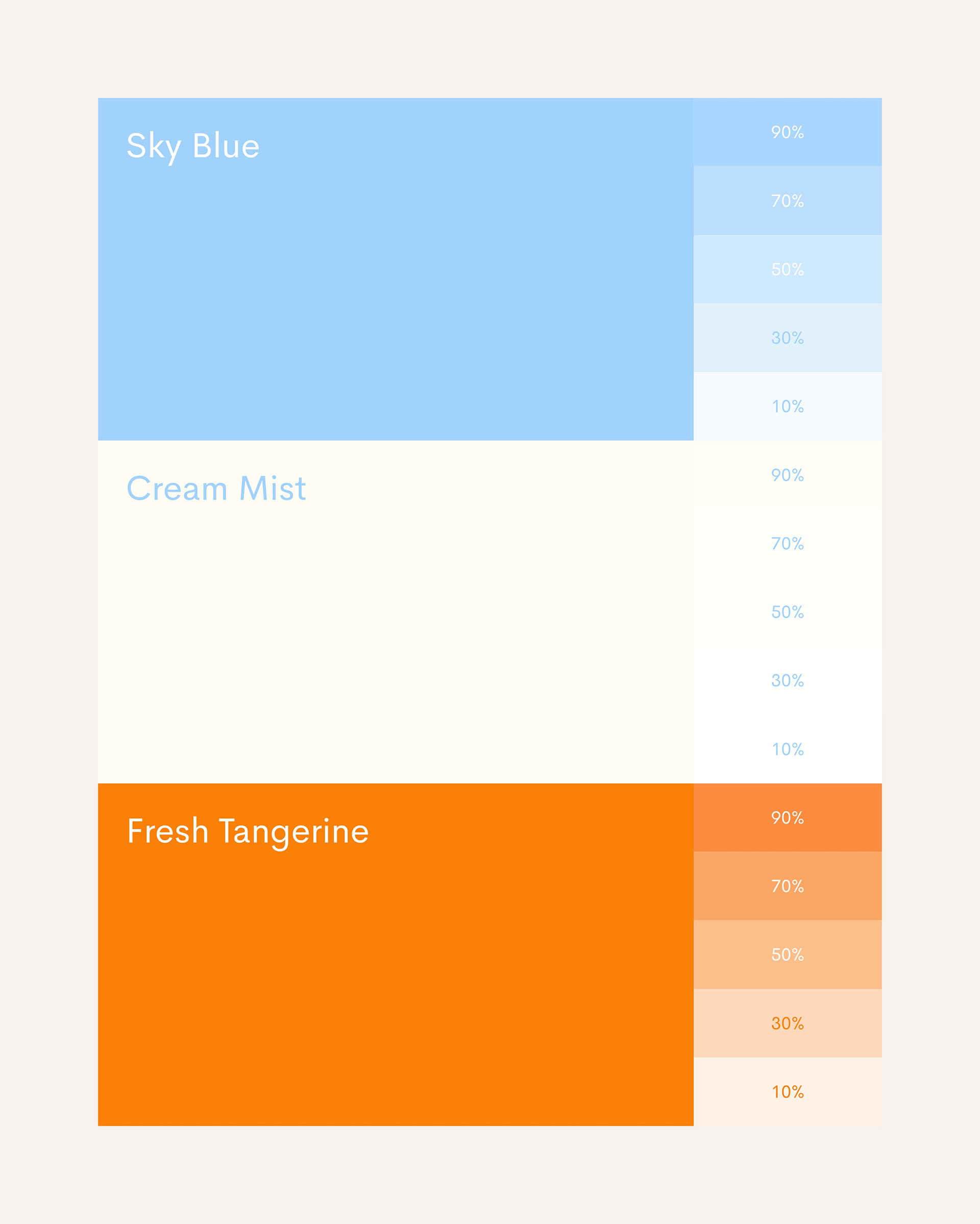
Washoo! is a modern laundry service redefining convenience for busy professionals, students, and working families across Bandung and Jakarta. Positioned at the sweet spot between affordability and quality, Washoo! transforms laundry from a chore into a trusted ritual. The brand philosophy, "Laundry You Can Trust: Cared For With Heart, Delivered With Standard", speaks to three core promises: meticulous care, systematic reliability, and accessible pricing. Visually, Washoo! embraces a fresh, optimistic aesthetic: a sky blue foundation evokes cleanliness and calm, while a vibrant tangerine accent injects energy and approachability. The palette is completed by warm cream tones that soften the experience, creating a brand identity that feels both professional and genuinely human.
the process
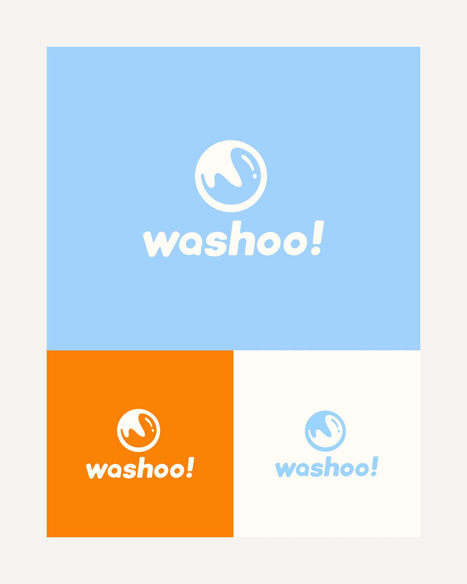
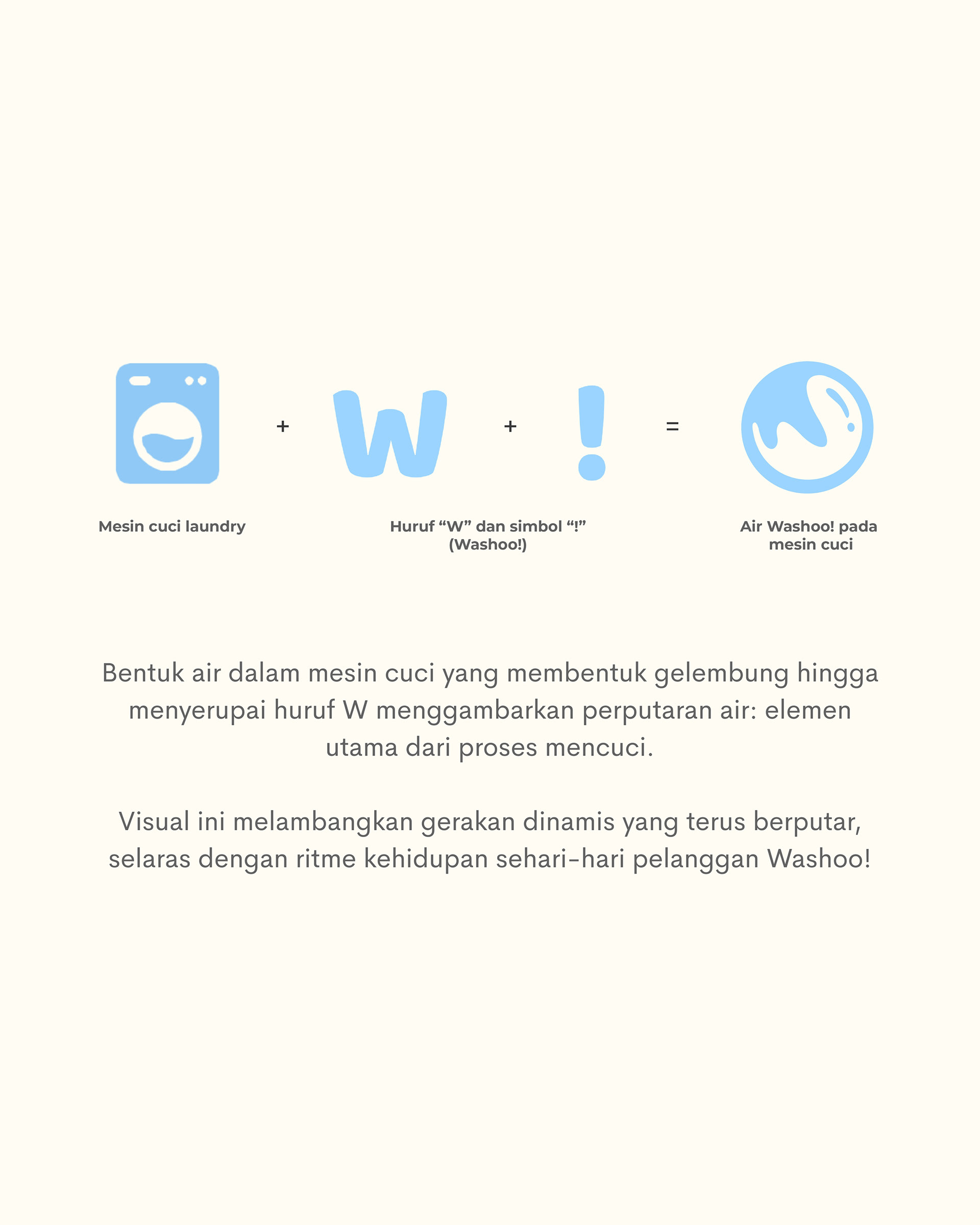
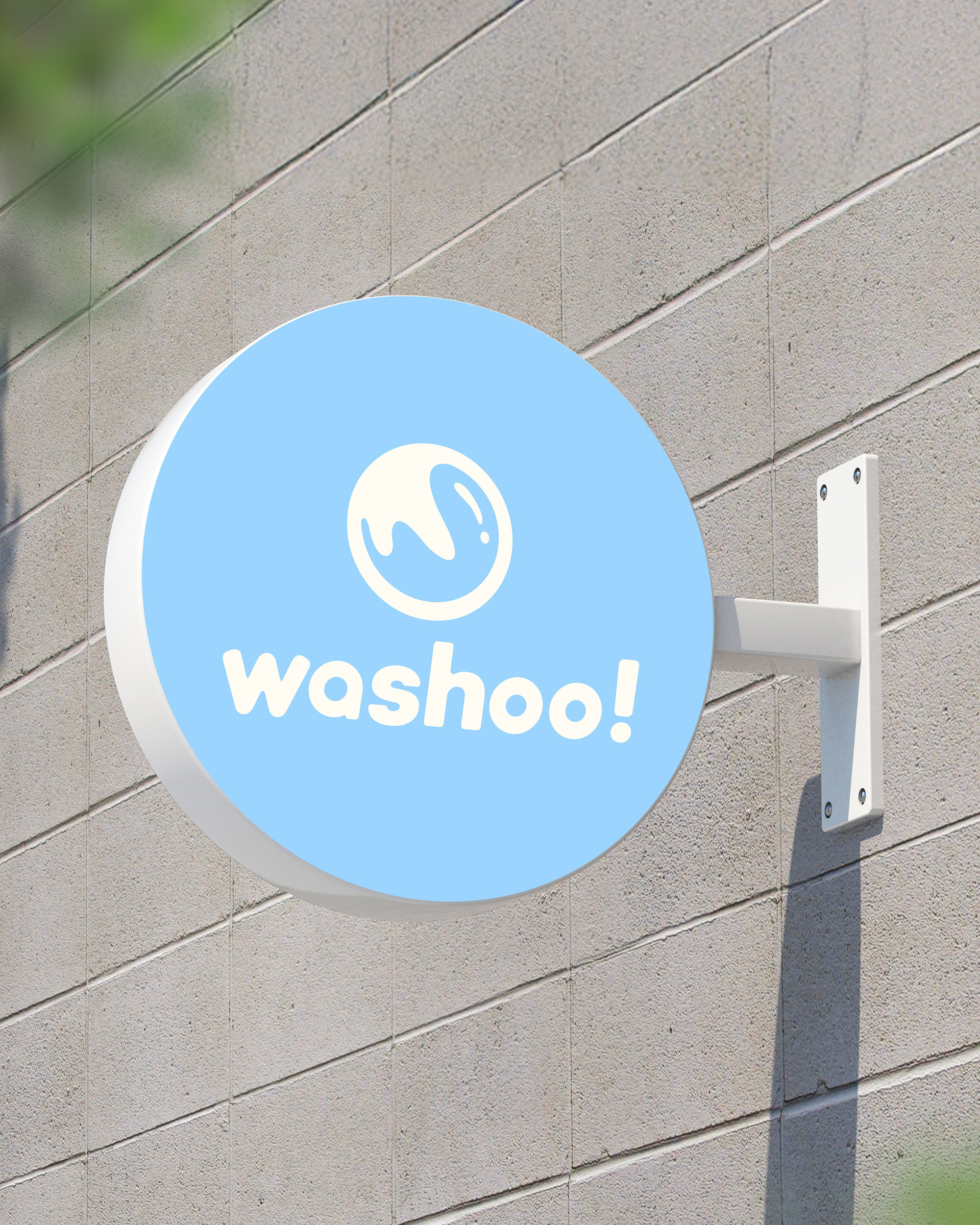
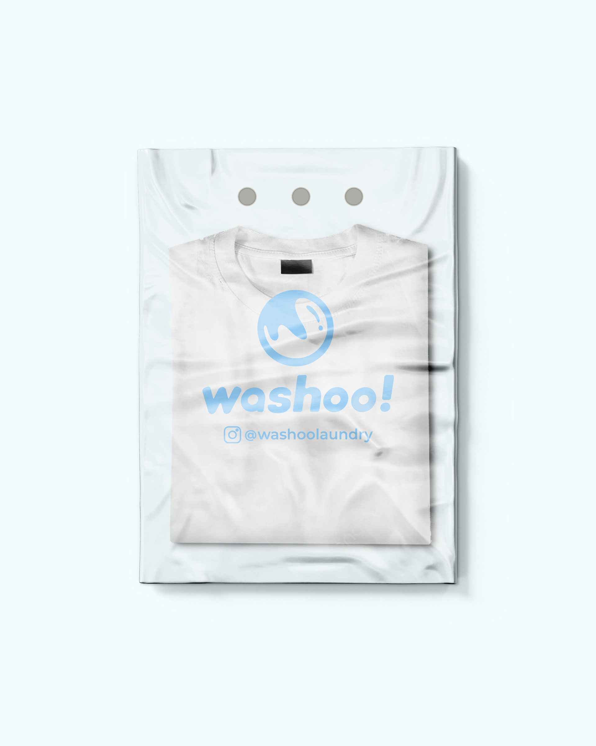
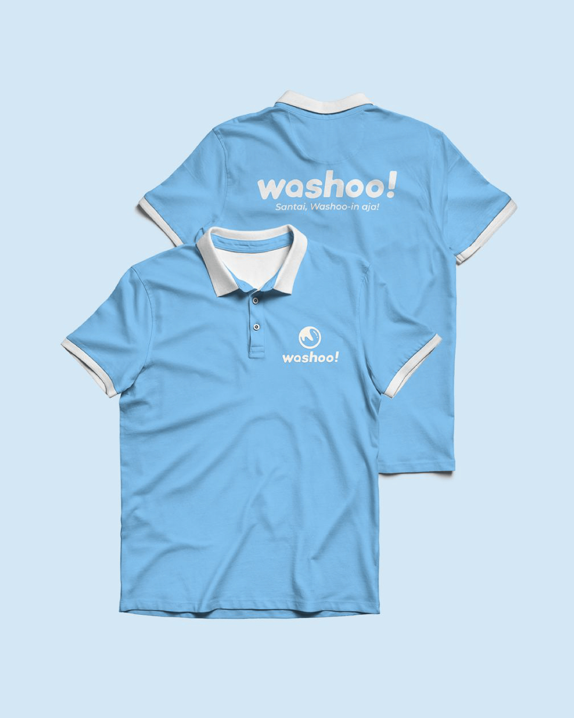
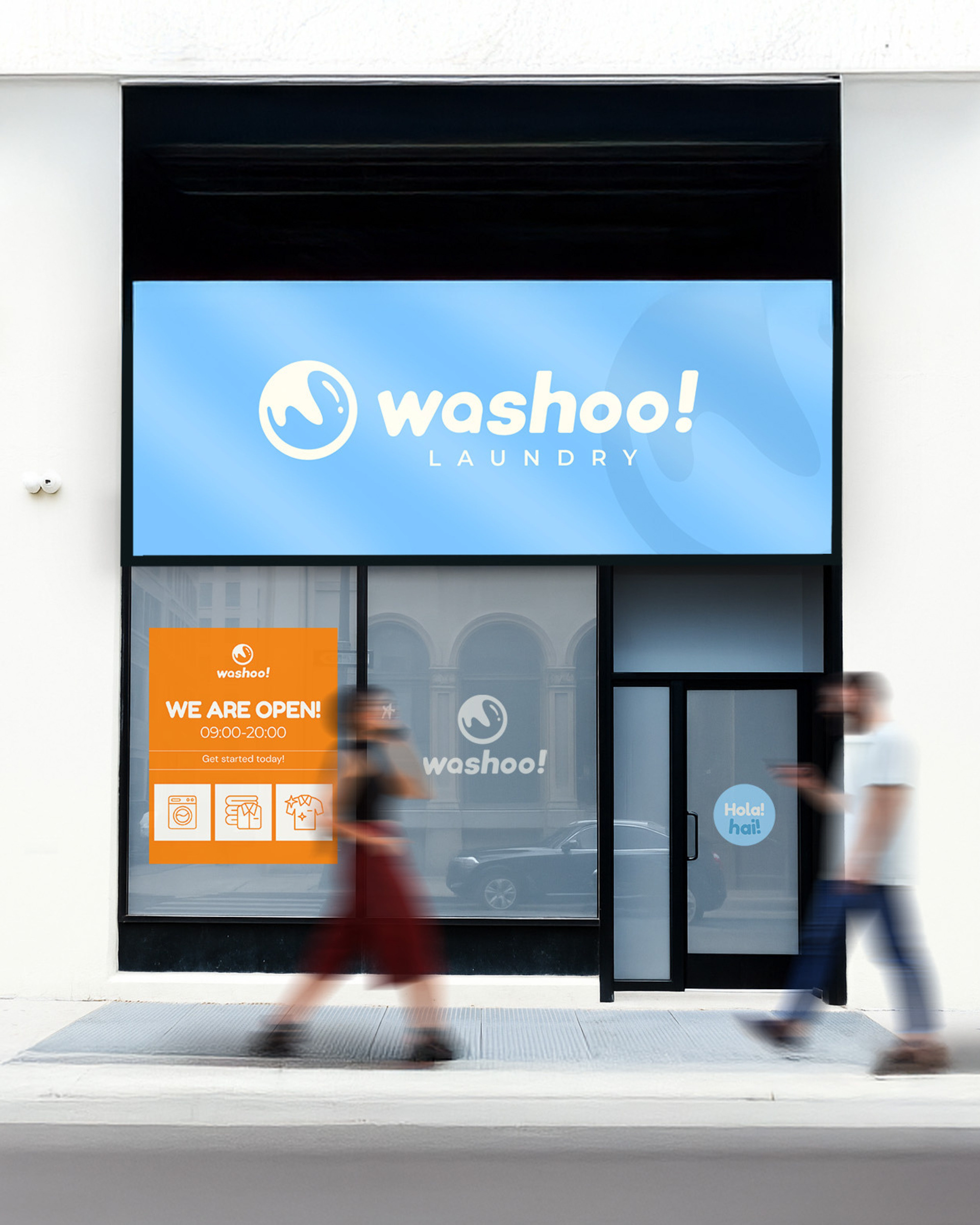
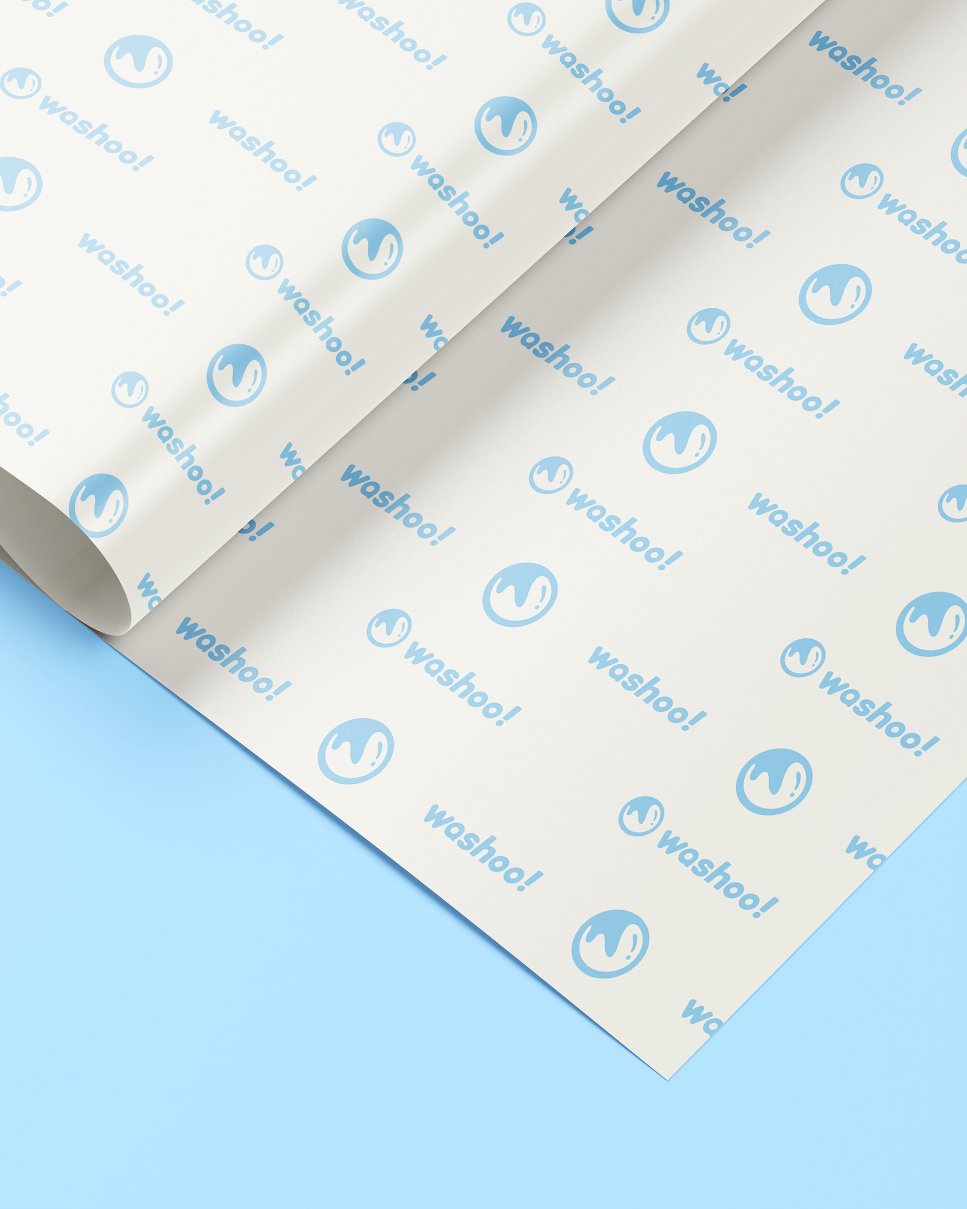
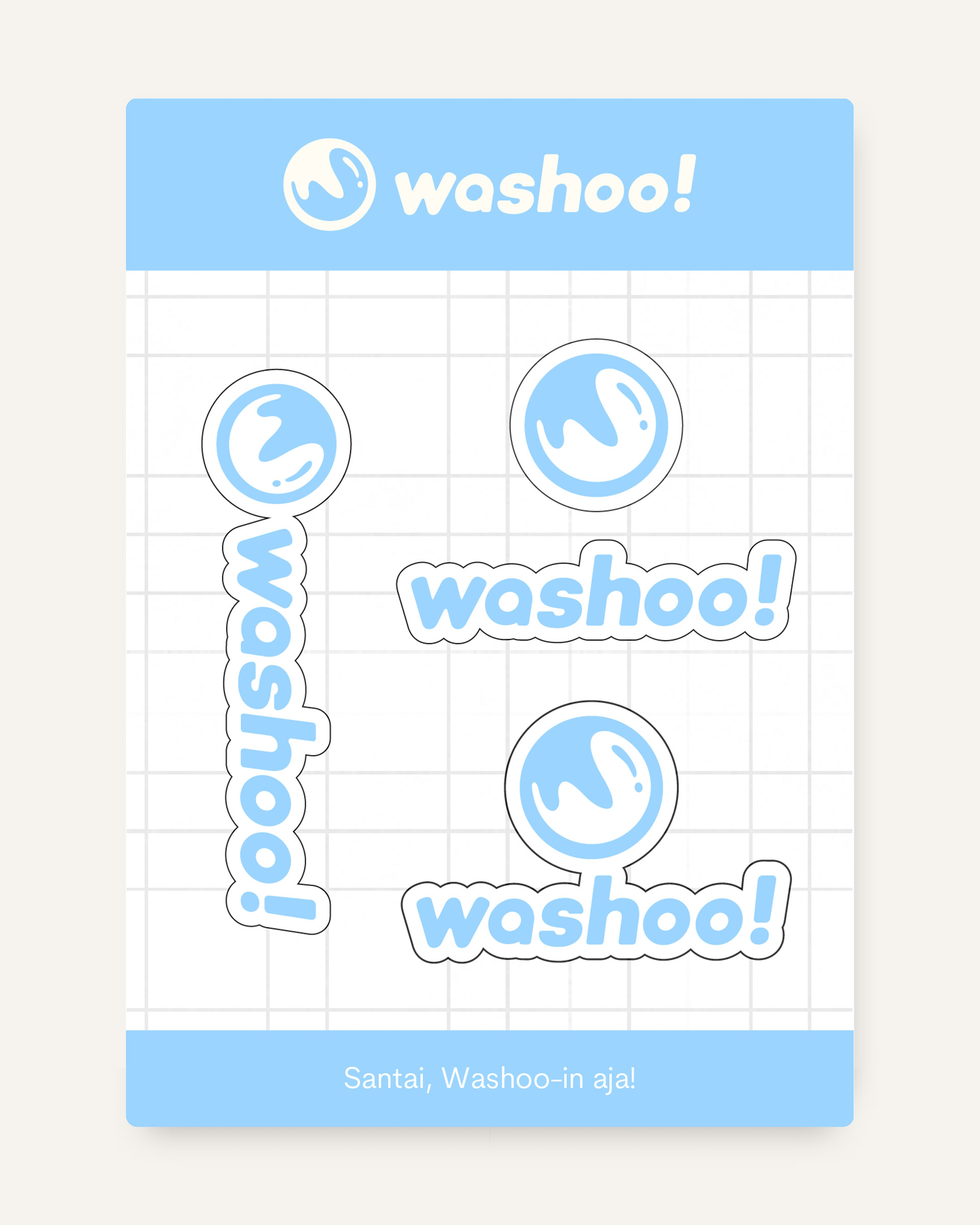
We developed a comprehensive brand identity system for Washoo! that balances three distinct archetypes: The Caregiver (care & trust), The Everyman (simplicity & relatability), and The Ruler (consistency & standards). The cornerstone is the dynamic W-water mark logo, where flowing water forms the letter W, symbolizing both washing machine motion and life's daily rhythm. Our scope encompassed a complete ecosystem: a typographic hierarchy using Fredoka and Montserrat, a calibrated color system with strategic tints, and application designs spanning branded packaging, staff uniforms, retail signage, and neon boxes. Every touchpoint, from logo specifications to brand voice guidelines, was crafted to ensure Washoo! feels consistently trustworthy across all customer interactions, speaking authentically to working mothers, professionals, and students alike.
credits
Client — Berlo
Brand Identity — Circa Creatia
Teams — Nuriana Sekarlintang, Riza Fauzia, Cita Filda, Rifqy Achmad K.
Year — 2025