the brand
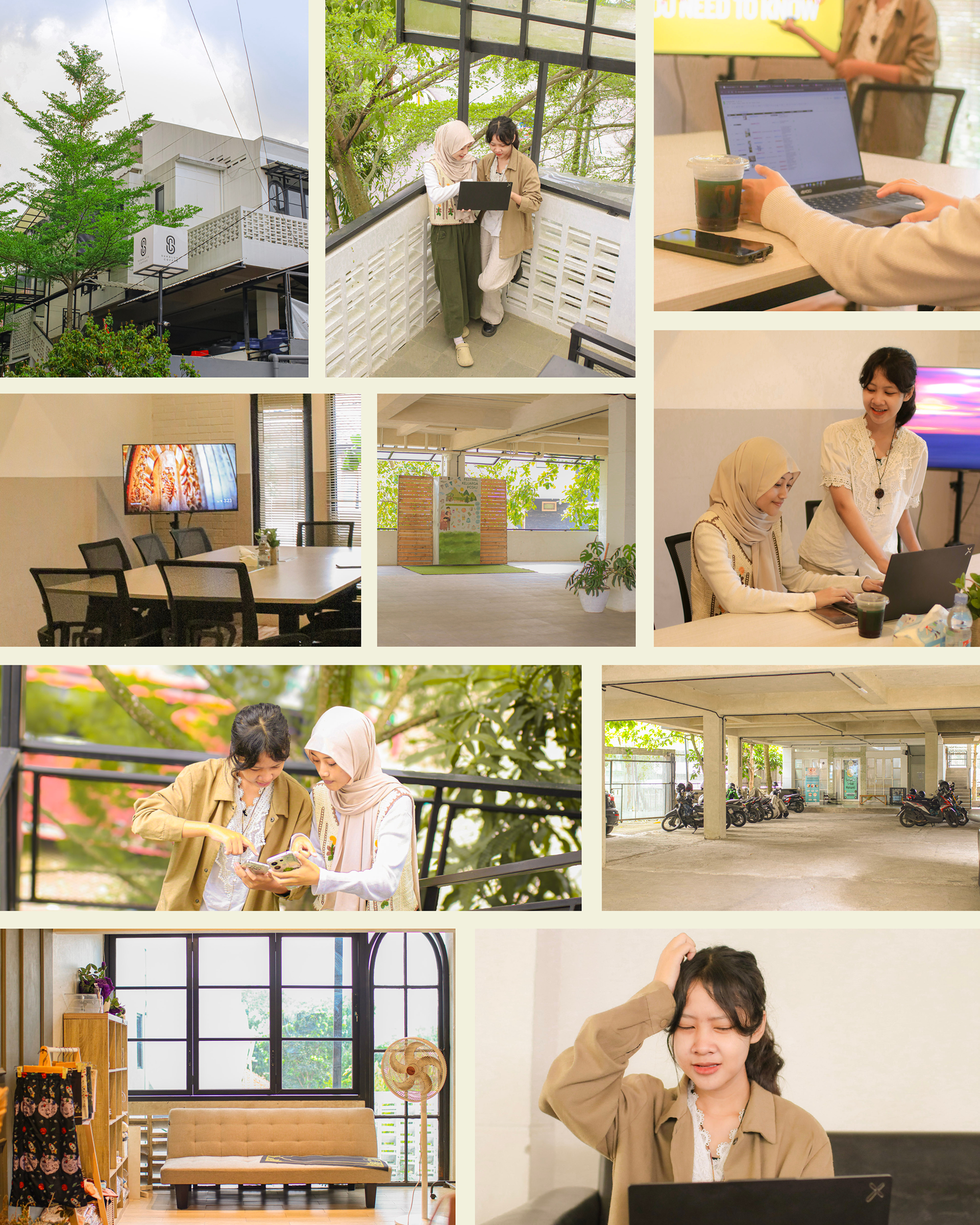
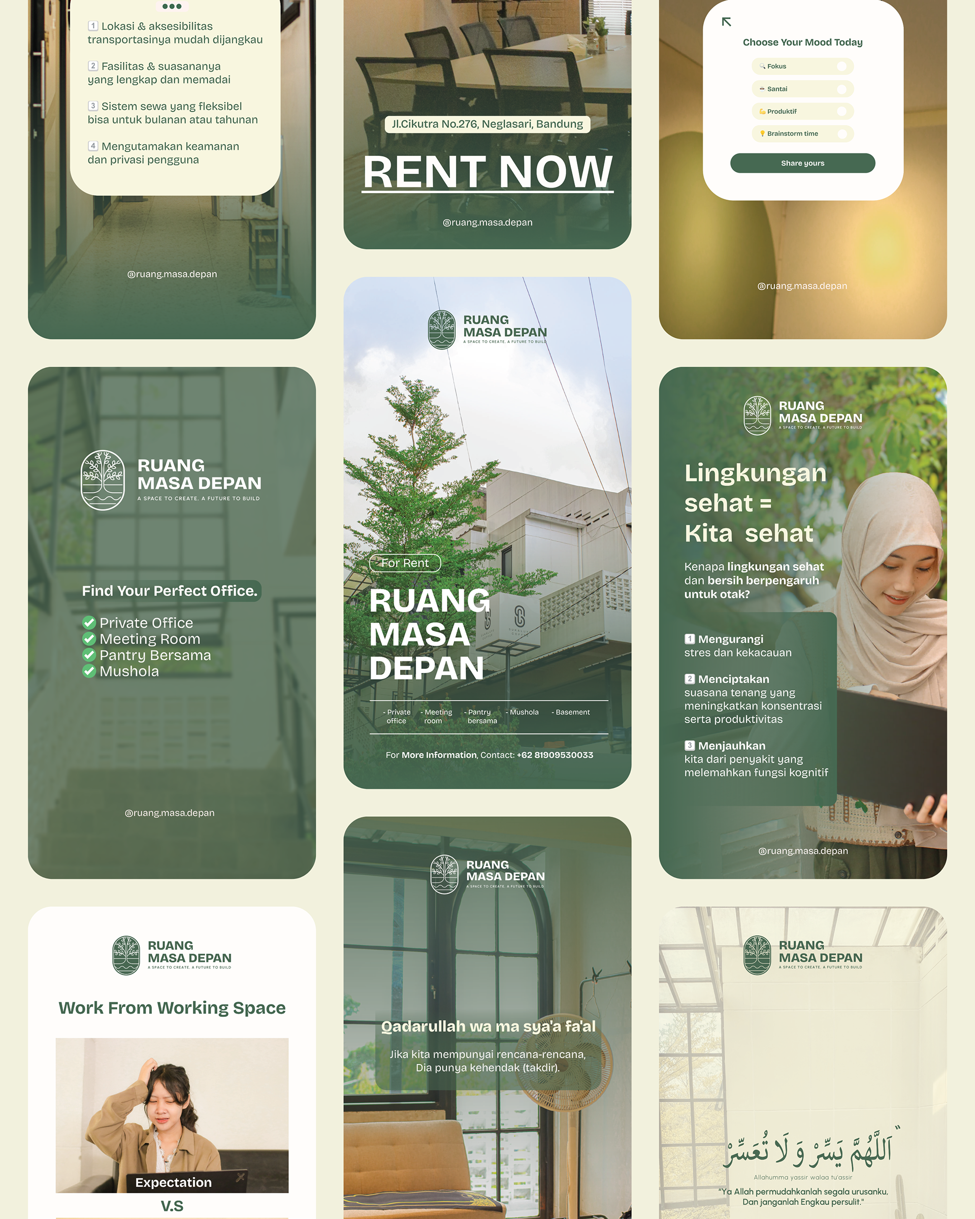
Ruang Masa Depan is a dynamic workspace ecosystem designed specifically for startups and early-stage entrepreneurs. More than just a rental office, it positions itself as a "Growth Incubator", offering affordable, flexible, and fully equipped environments where ideas can take root. With the tagline "A Space to Create, A Future to Build," the brand differentiates itself from typical cold, corporate coworking spaces by integrating a "Green Environment" philosophy. It promises a balance of productivity and well-being, providing 24/7 secure access, high-speed connectivity, and nurturing communal areas that foster collaboration and mental clarity.
the process
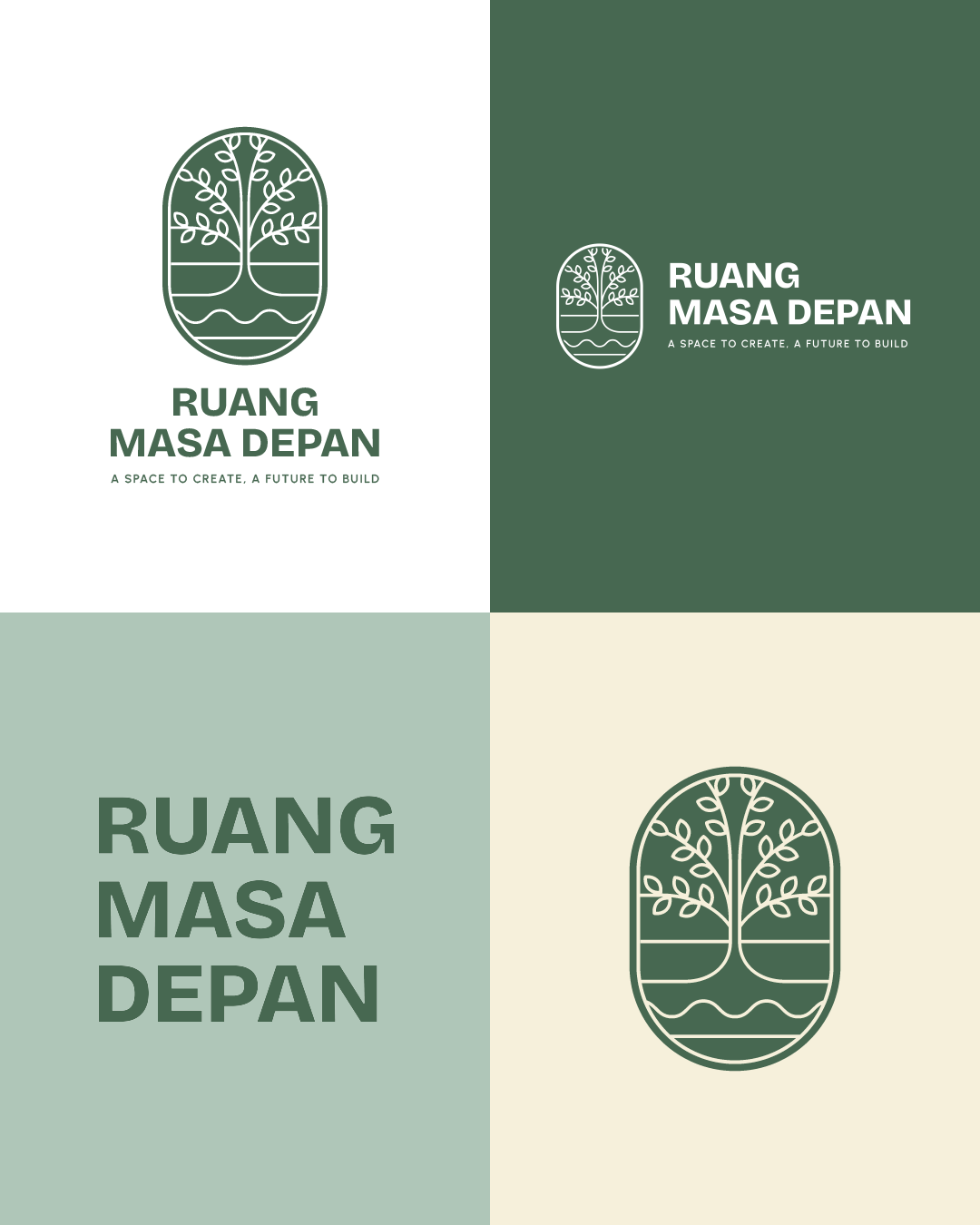
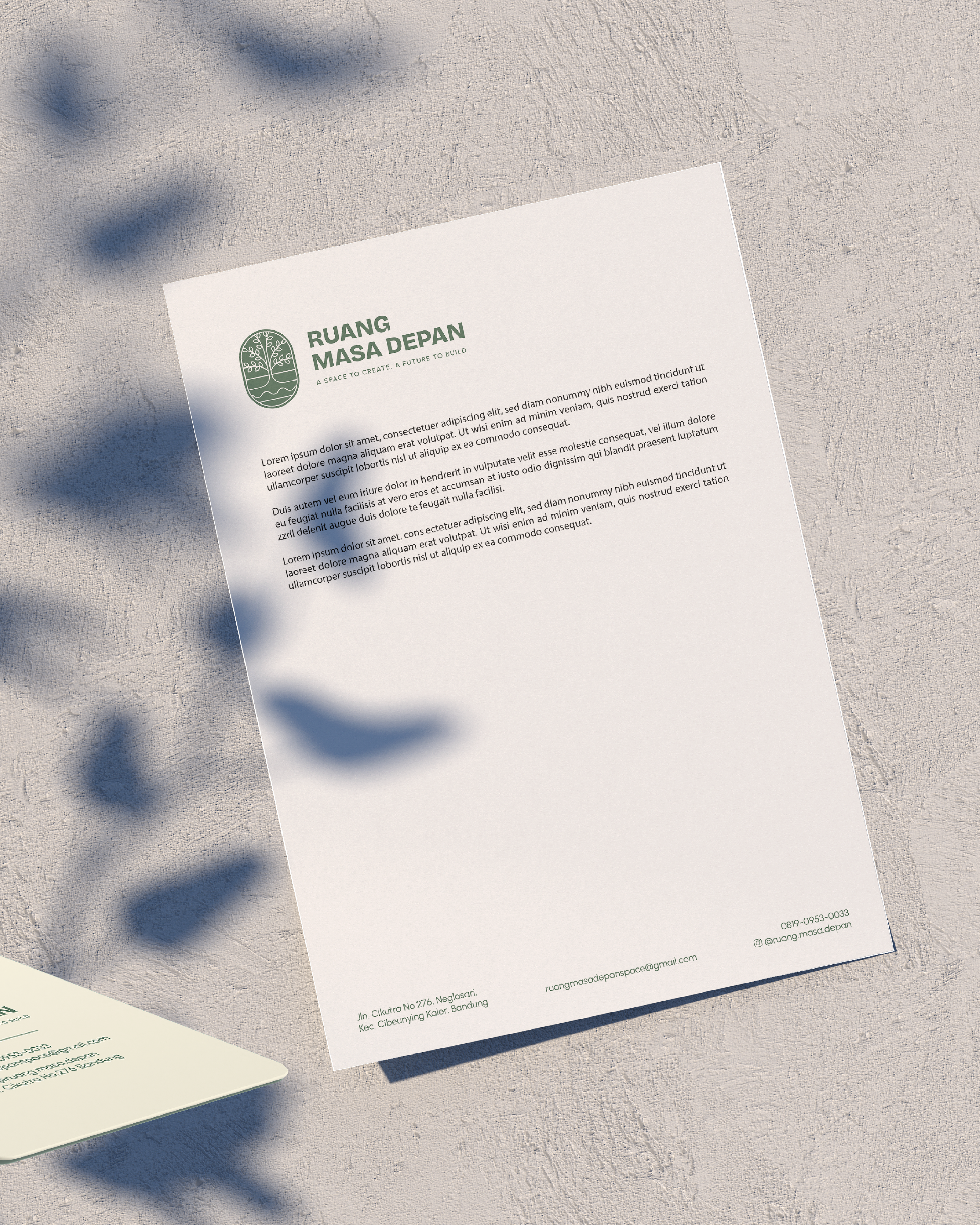
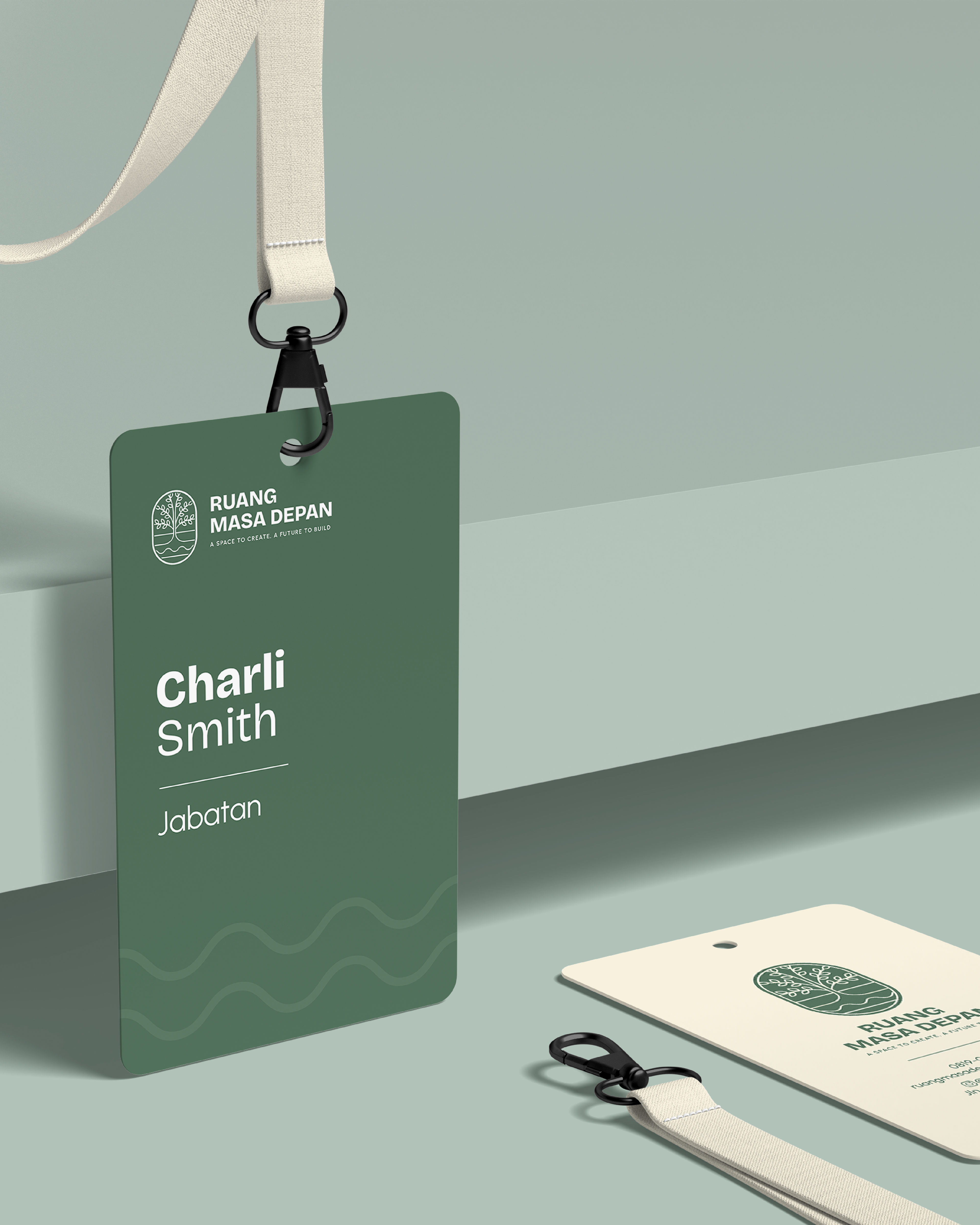
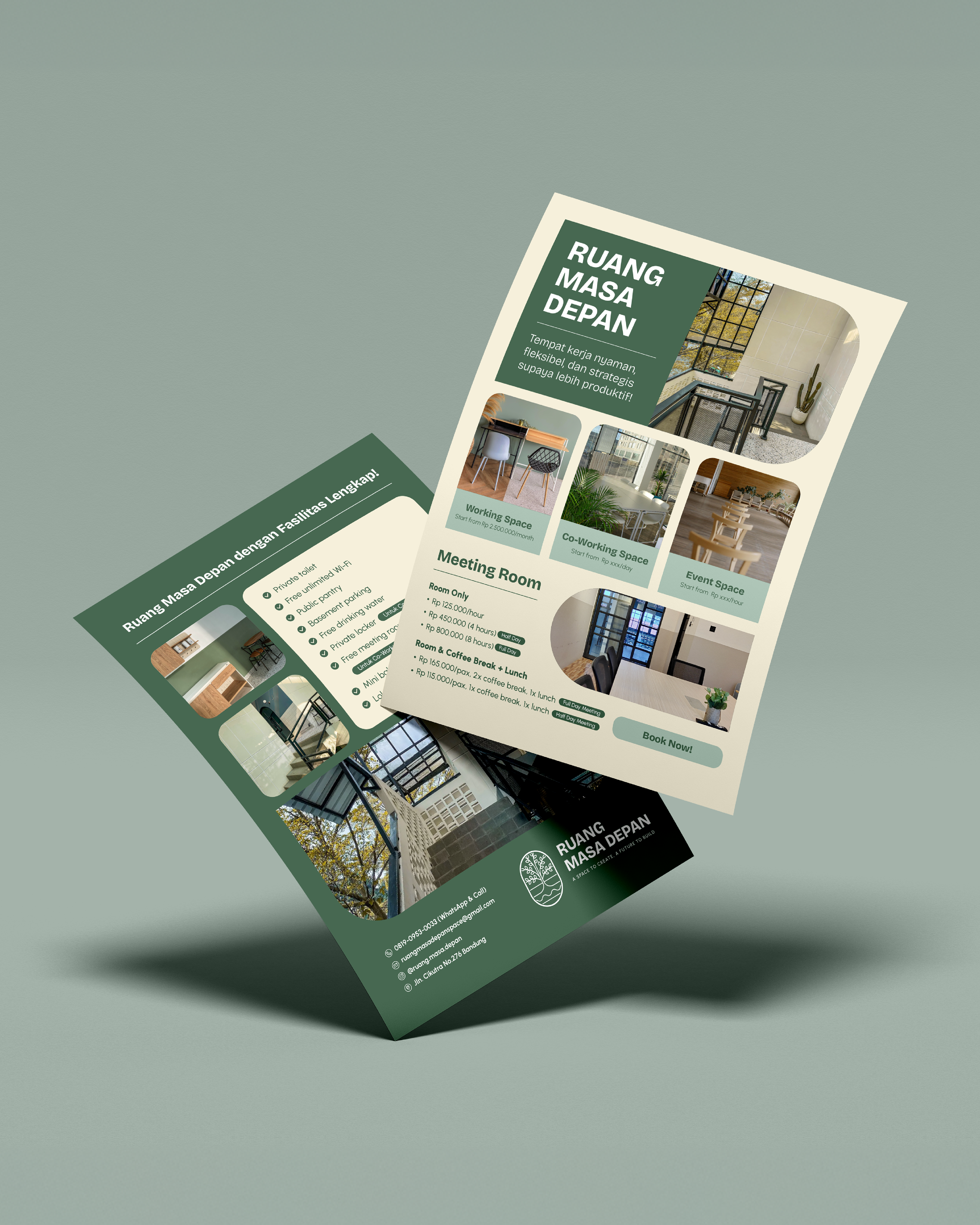
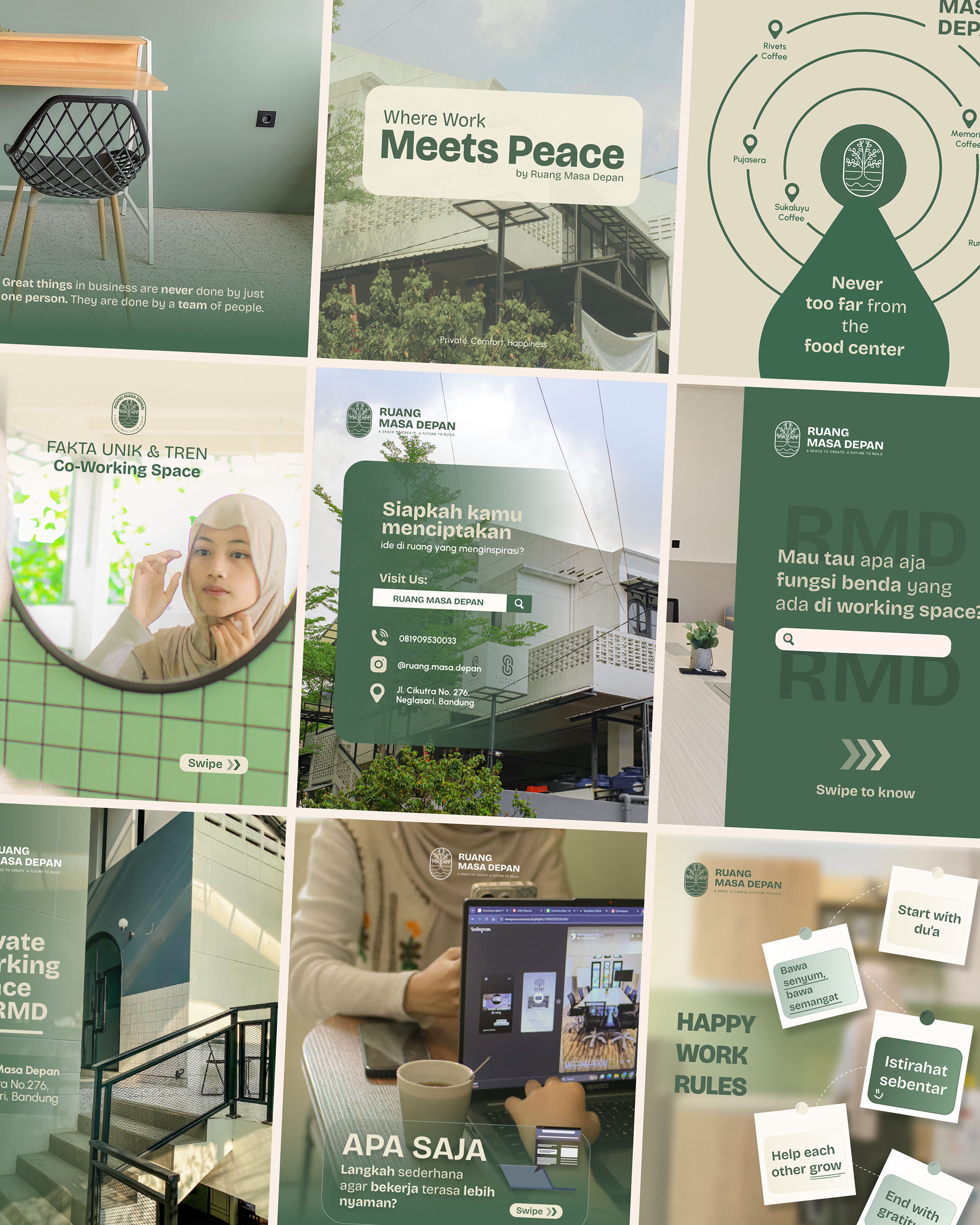
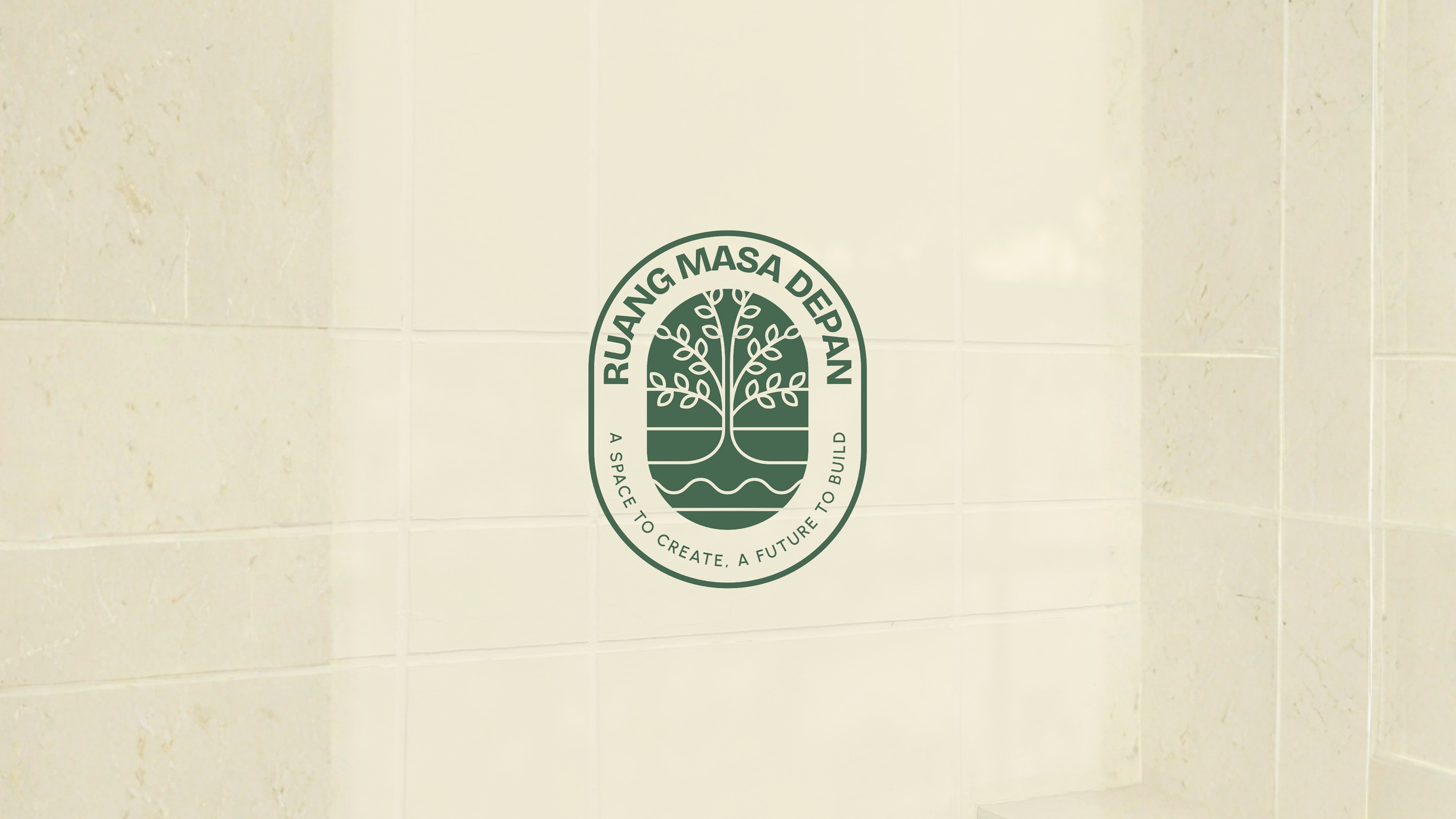
Our objective was to visualize the concept of "Shelter and Growth." We moved away from the standard tech-heavy, industrial aesthetic of coworking spaces and adopted a more Organic and Nurturing identity. The core concept is built around the Linden Tree (Basswood) philosophy, a symbol of protection, harmony, and community. The logo combines a sturdy trunk (Foundation) with organic leaves (Innovation) encased in a circle (Unity). The color palette reinforces this calming atmosphere, utilizing Feldgrau (Deep Forest Green) for stability, paired with Eggshell and Opal to keep the visual weight light and airy. The typography pairs the quirky character of Bricolage Grotesque with the clean utility of Urbanist, creating a look that is modern but deeply human.
credits
Client — Ruang Masa Depan
Brand Identity — Circa Creatia
Teams — Nuriana Sekarlintang, Riza Fauzia, Cita Filda, Albi Anfasa, Dicky Junaedi, Vania Anindya, Billahi Hiya
Year — 2025