
the brand
PROVEN! Academy is an educational platform designed to bridge the critical gap between theory and professional reality. Built on the philosophy of "From One Expert to Another," the academy connects learners with experienced industry practitioners. The brand identity centers on the concept of "Evidence & Action." Unlike general course providers, PROVEN! focuses on practical, real-world skills that are immediately applicable. The brand voice is Encouraging, Competent, and Direct, represented by the exclamation mark in the name, signaling excitement and the confidence that comes from proven results.
the process
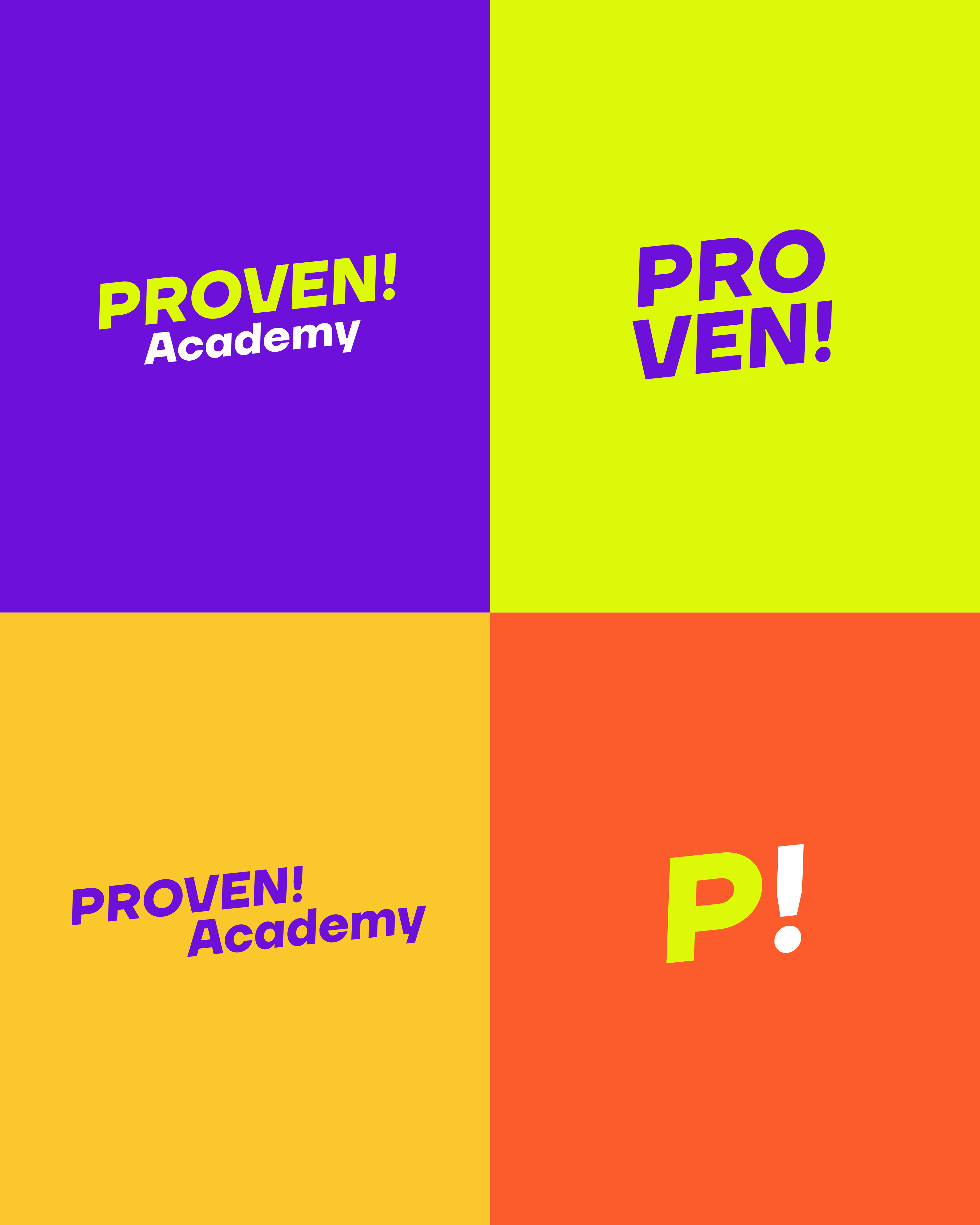
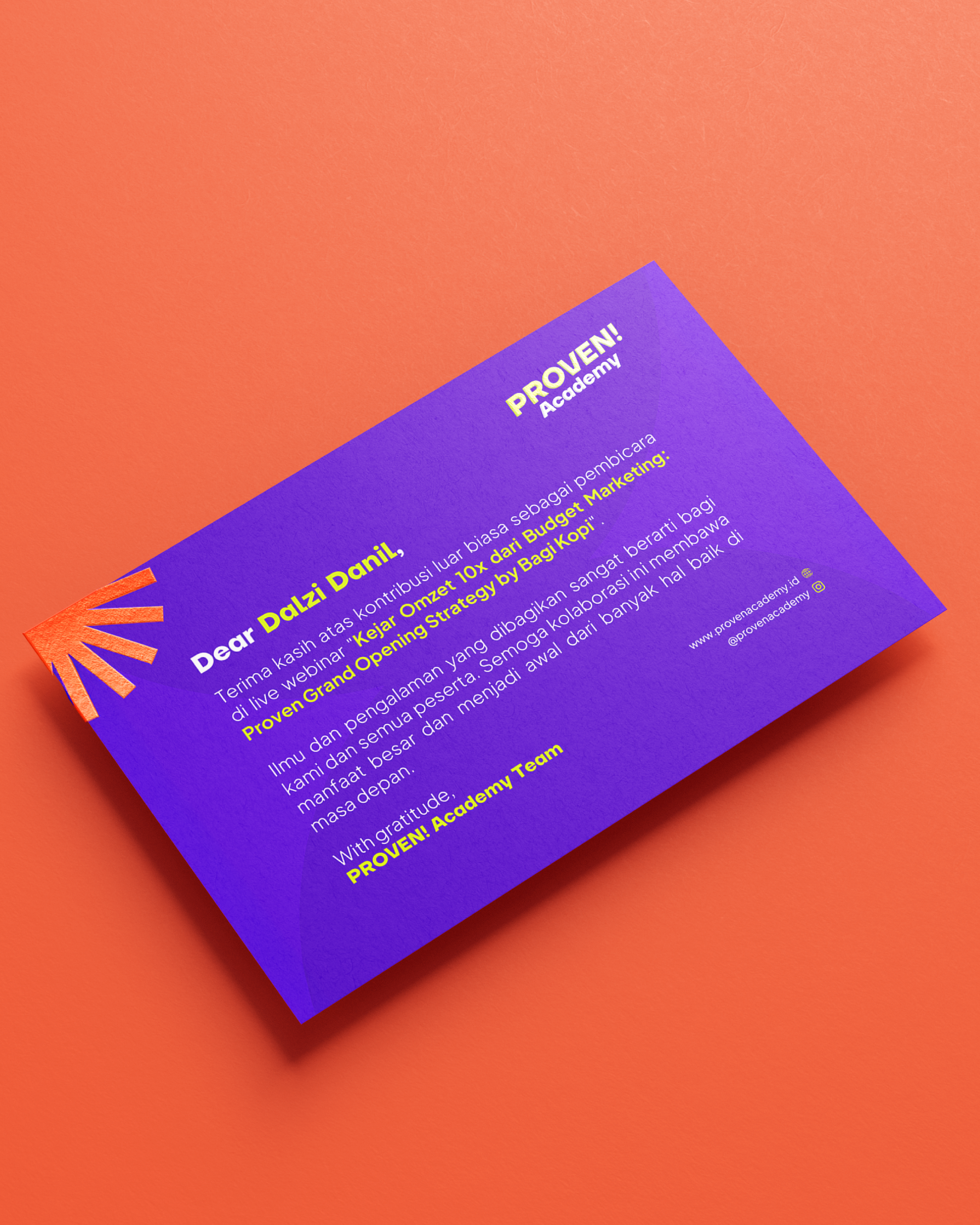
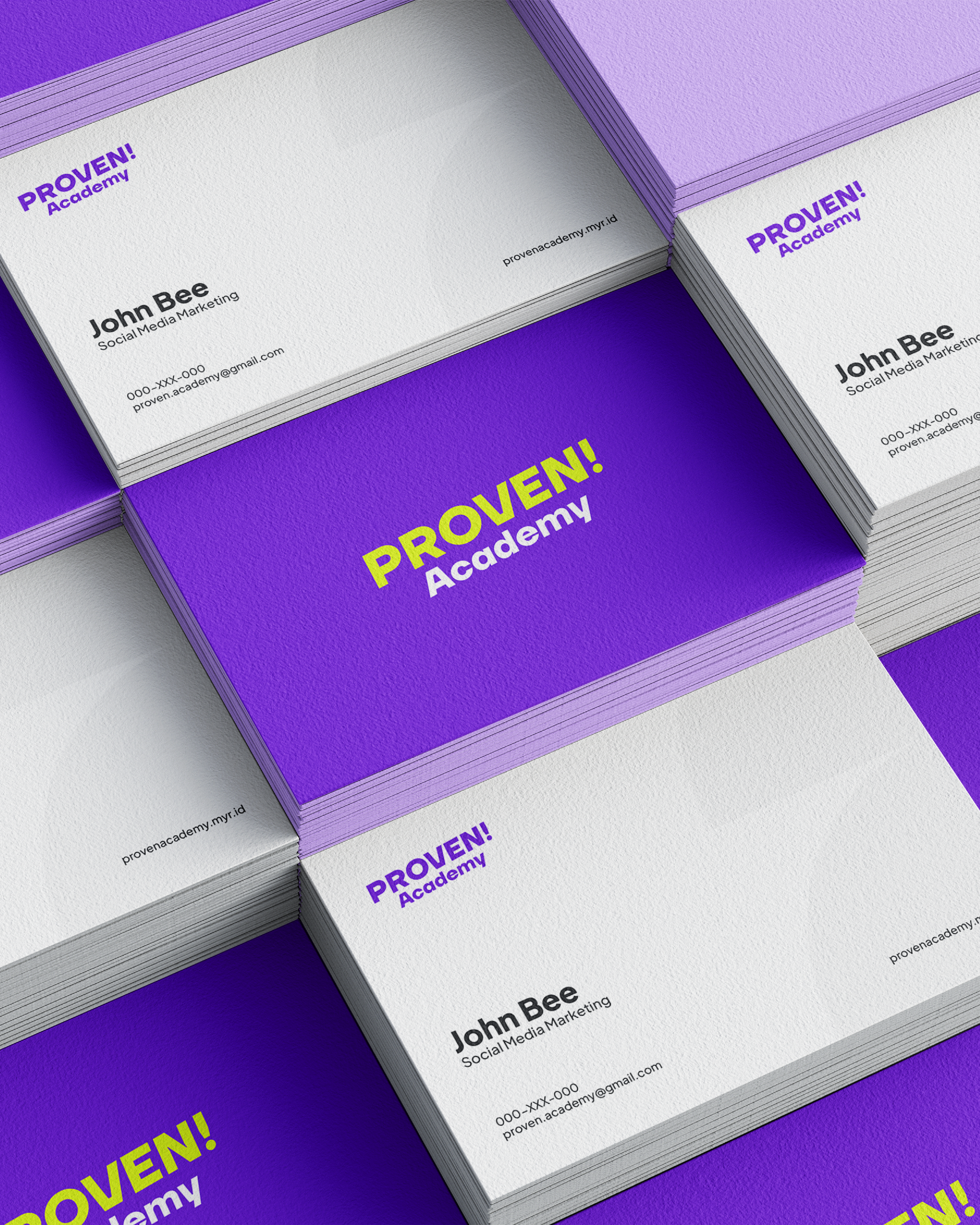
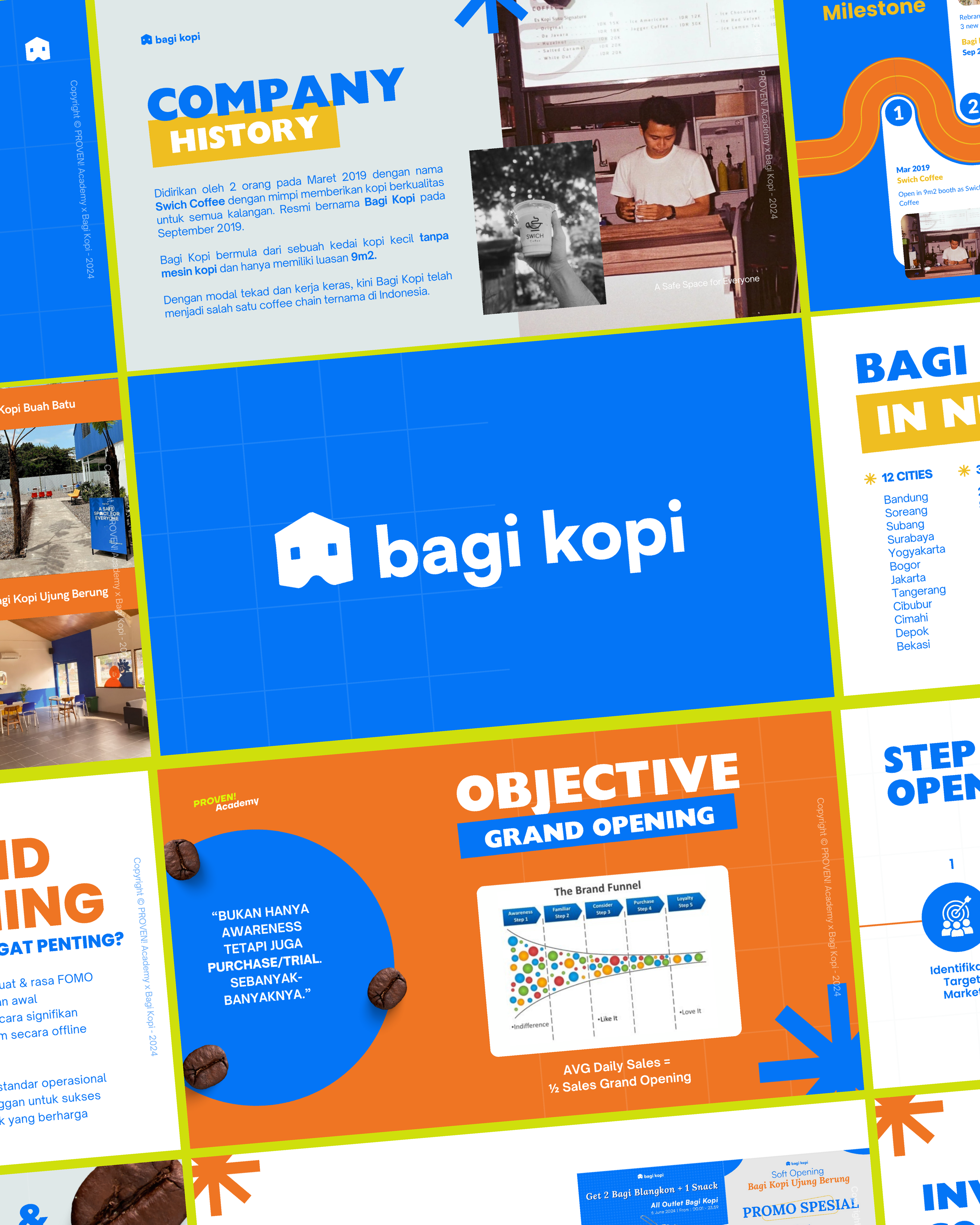
Our challenge was to create a visual identity that feels "Educational" but "Dynamic", enough to engage the Gen-Z audience. The visual system is built around the "P!" monogram, where the exclamation mark serves as a flexible graphic element—symbolizing the "Aha!" moment of learning and the impact of taking action. We developed a robust Design System to handle the heavy information flow. This included modular slide decks, social media templates, and event collateral that prioritize Readability and Hierarchy, ensuring that complex topics are digested easily without losing the professional edge.




credits
Client — PROVEN! Academy
Brand Identity — Circa Creatia
Teams — Nuriana Sekarlintang, Riza Fauzia, Albi Anfasa
Year — 2024