the brand
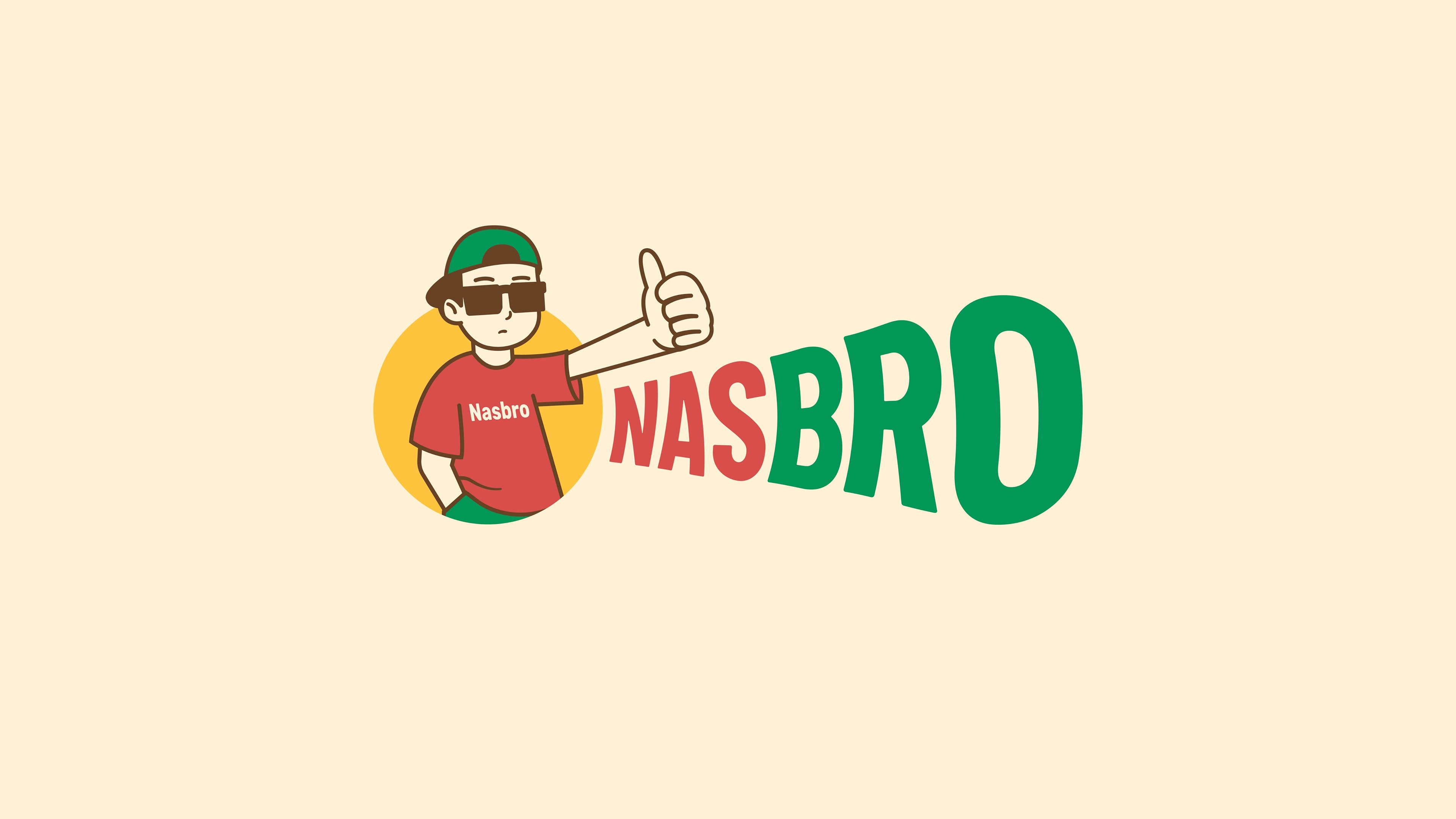
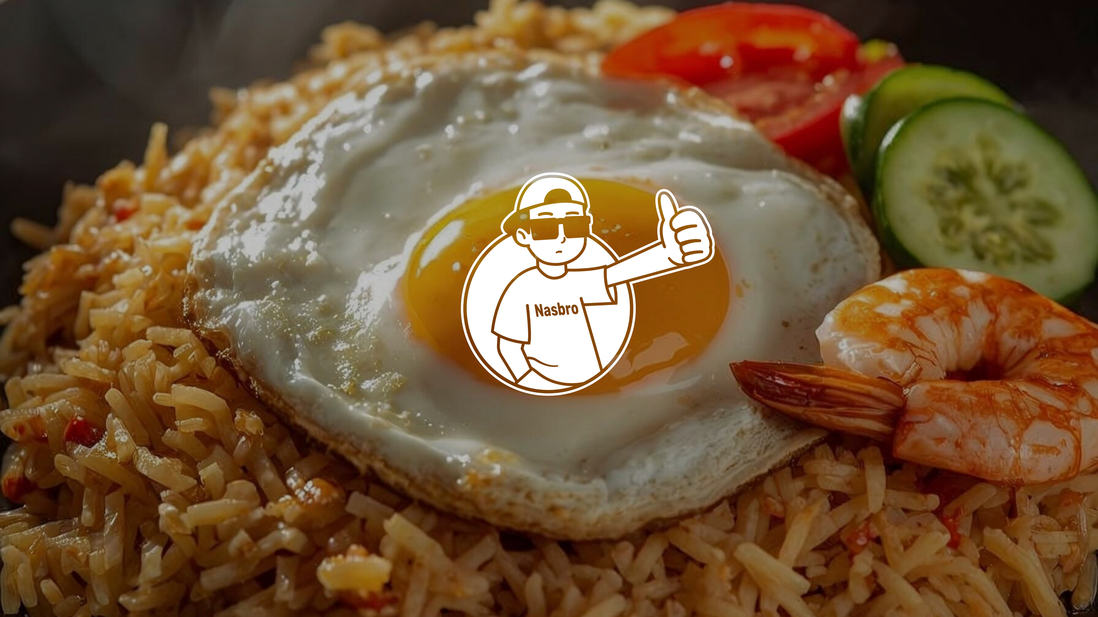
Nasbro is a F&B brand revitalizing Indonesia’s favorite comfort food: Nasi Goreng. The name is a playful contraction of "Nasi Goreng, Bro!", a phrase that captures the essence of casual hangouts and brotherhood. Positioning itself with the archetypes of The Jester and The Everyman, Nasbro is built on inclusivity, humor, and warmth. The brand promises "Perut Kenyang, Dompet Aman" (Full Tummy, Safe Wallet), appealing to students and young professionals who seek generous portions, authentic taste, and a friendly atmosphere that feels like hanging out with a best friend.
the process
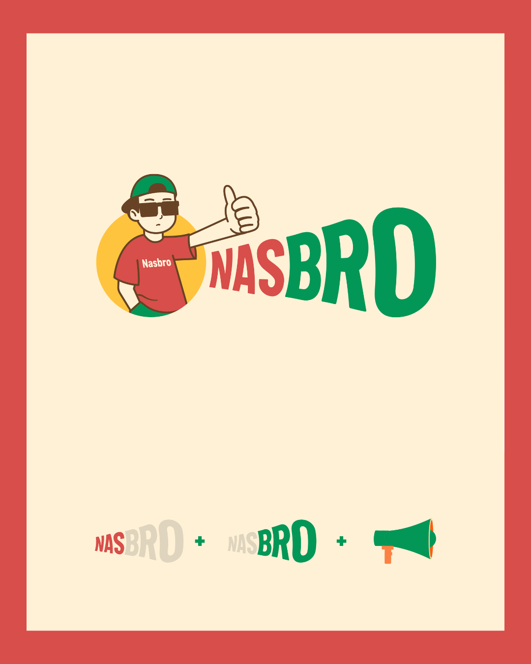
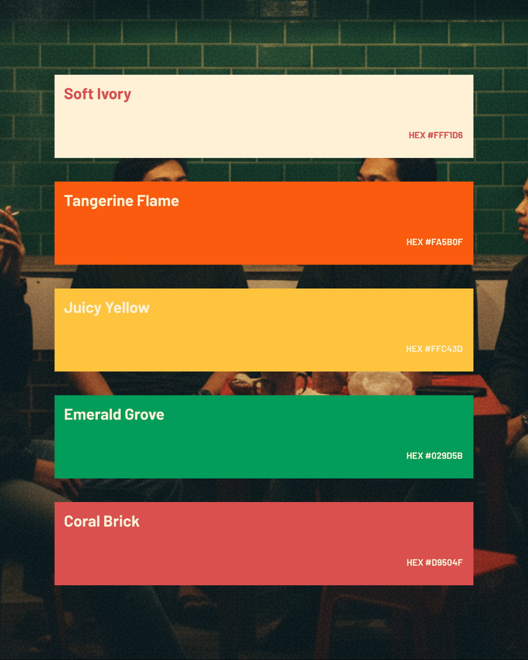
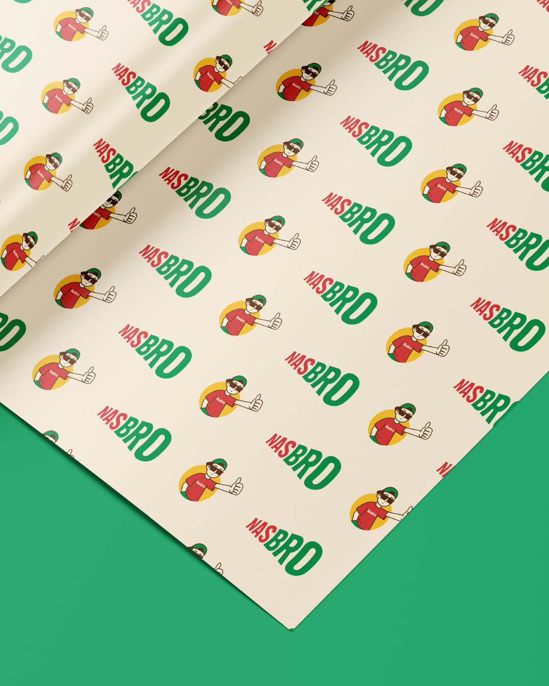
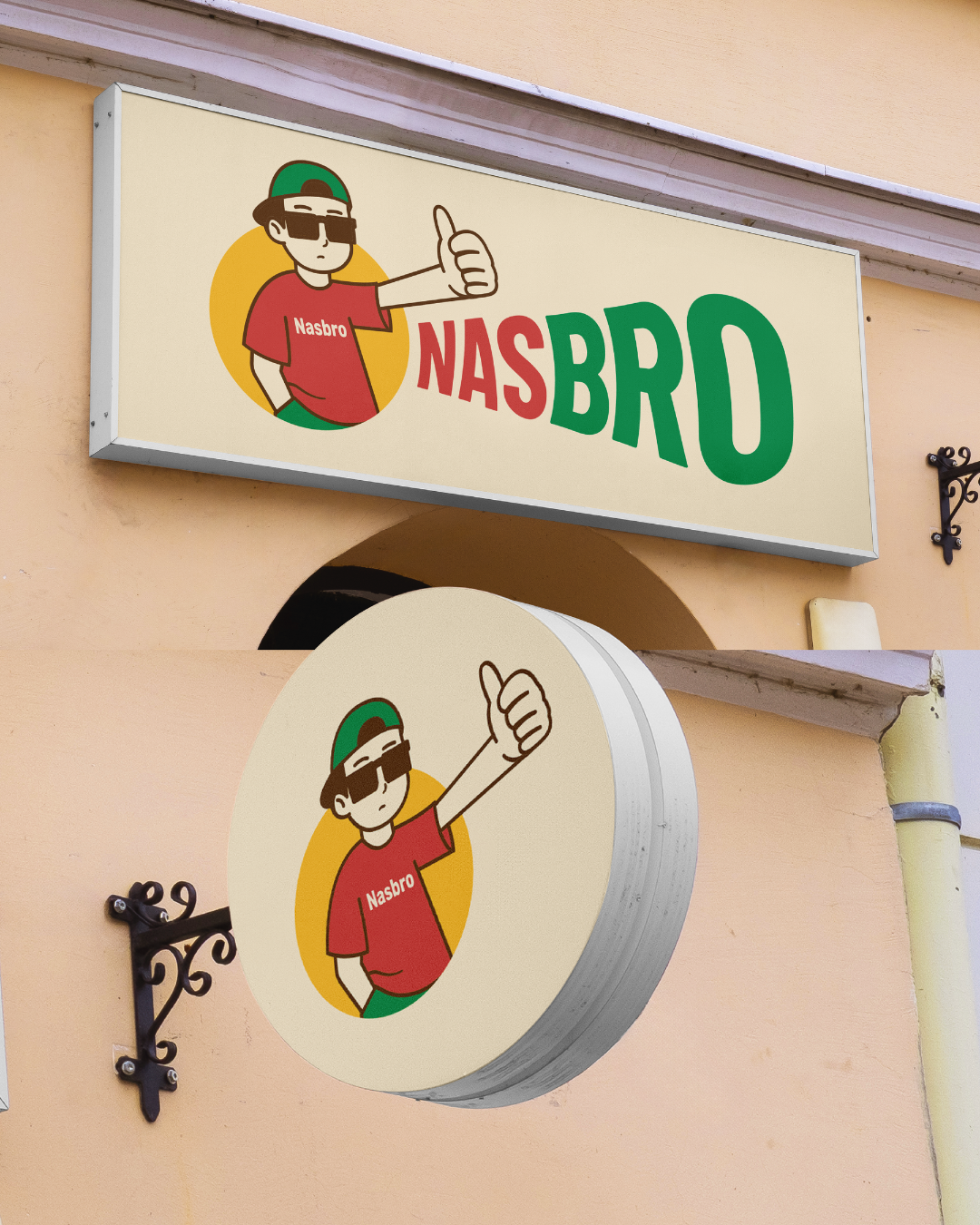
Our goal was to visualize the "sound" of a friendly greeting. The visual identity centers on a dynamic logotype where the word "NAS" (representing the heat of the wok) and "BRO" (representing community) are sized differently to create a visual rhythm, mimicking the intonation of someone calling out to a friend. We utilized a high-contrast color palette featuring Tangerine Flame to trigger appetite and Emerald Grove to symbolize freshness and harmony. To amplify the brand’s fun personality, we developed a character mascot and utilized "Megaphone" iconography, reinforcing the idea of "shouting out" the good news of great food. The result is a bold, street-ready identity that stands out in the crowded culinary landscape.
credits
Client — Nasbro
Brand Identity — Circa Creatia
Teams — Nuriana Sekarlintang, Riza Fauzia, Cita Filda, Riski Kusniyanto
Year — 2025