the brand
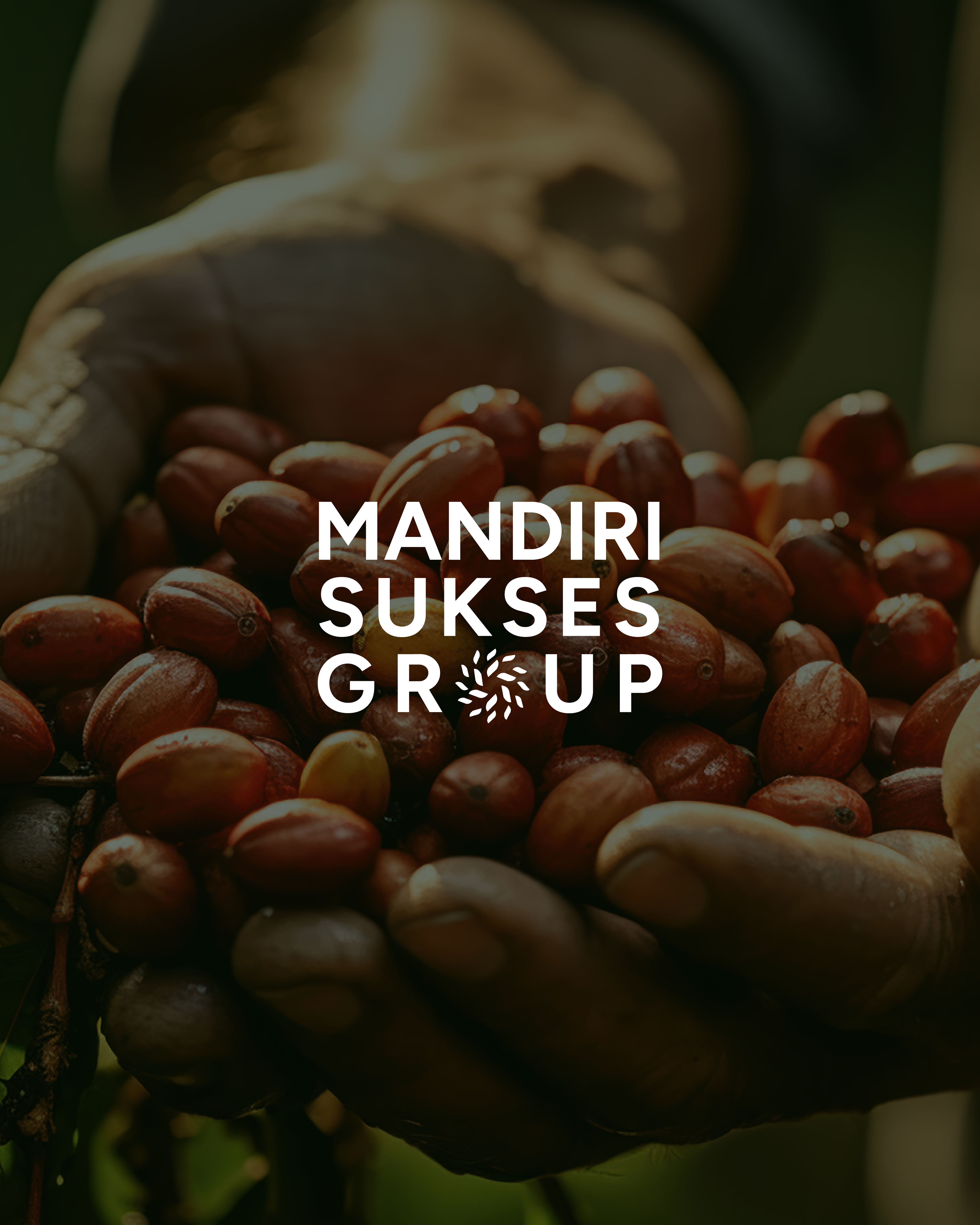
Mandiri Sukses Group is a prominent agribusiness focused on sustainable aquaculture and agriculture. The group operates through two primary divisions: Mandiri Sukses Fishery (specializing in premium Vaname Shrimp and Tilapia) and Mandiri Sukses Farm (focusing on high-quality Coffee Seedlings). In an industry often plagued by opacity, Mandiri Sukses Group stands for Transparency and Quality. They position themselves not just as suppliers, but as stewards of nature, delivering products that are "Fresh from the Source." The brand targets B2B distributors and conscious consumers who value traceability, sustainability, and consistent industrial standards.
the process
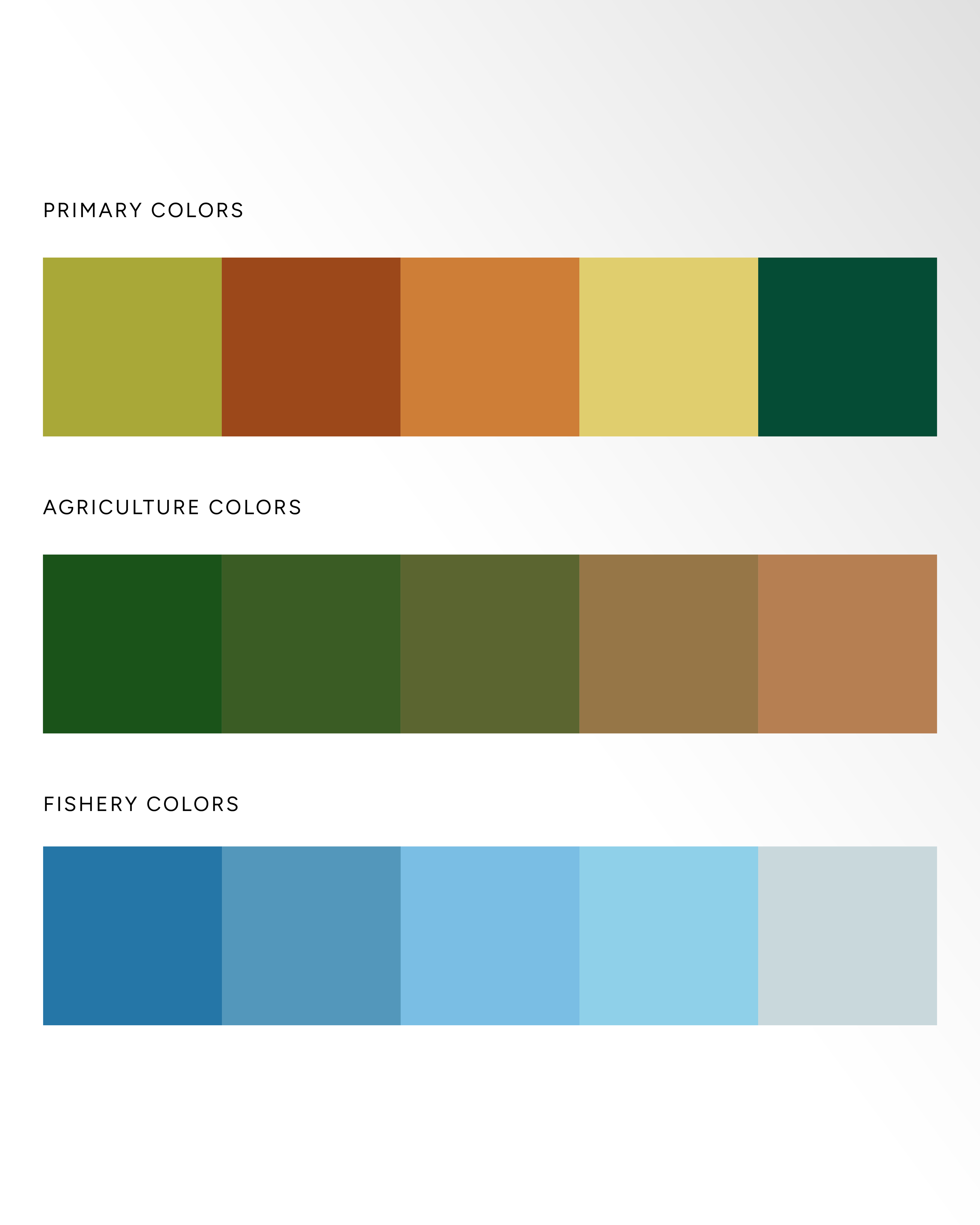
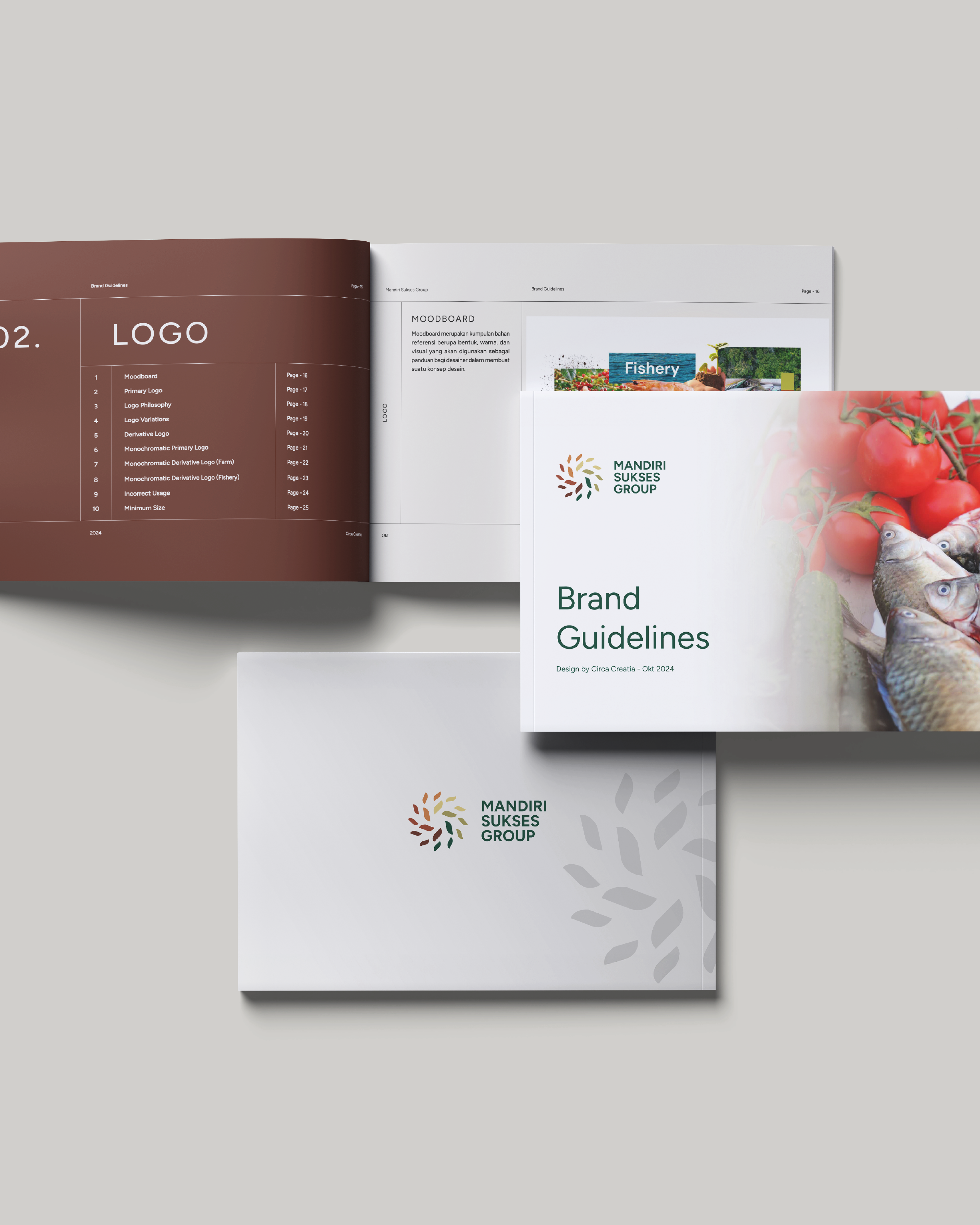
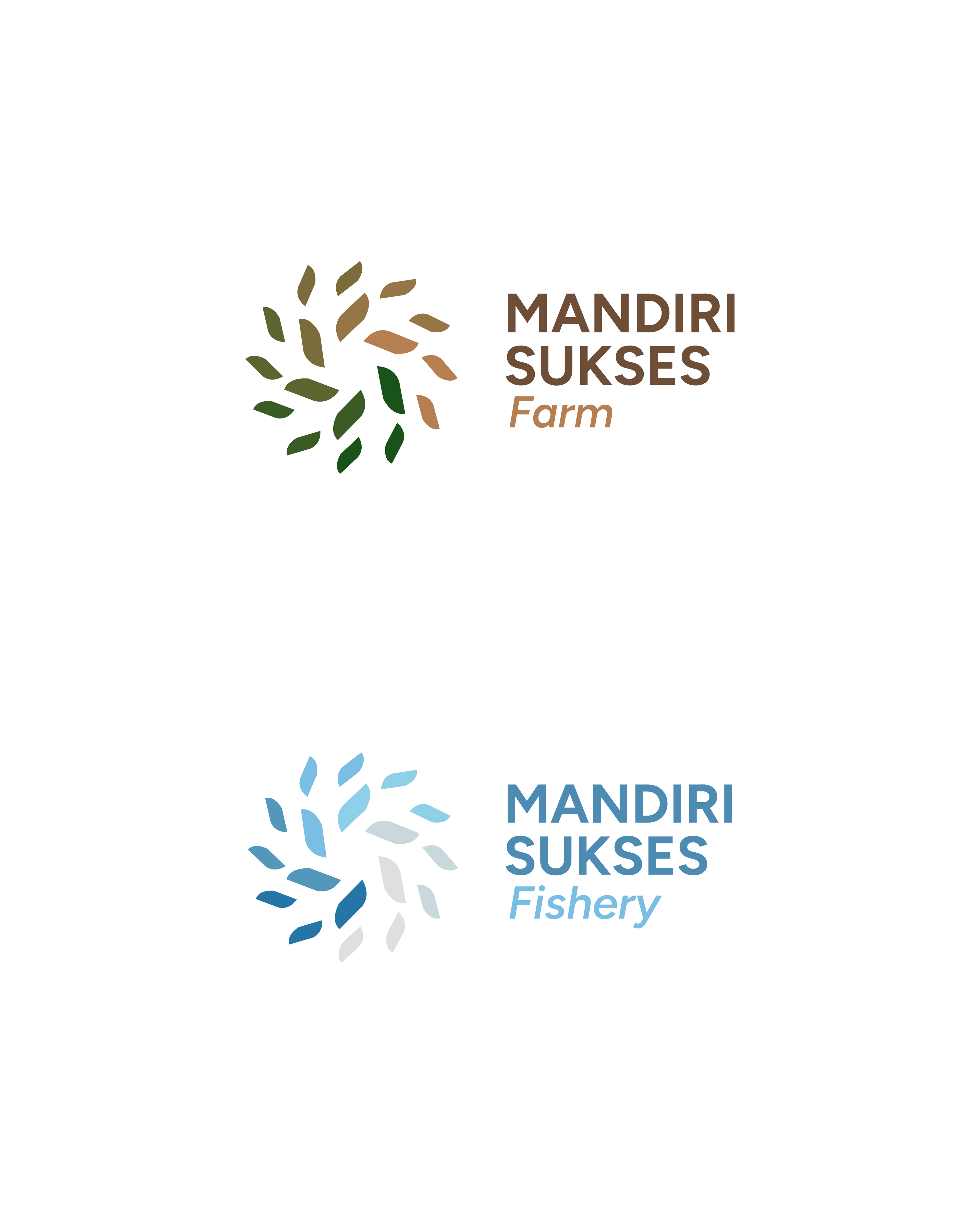
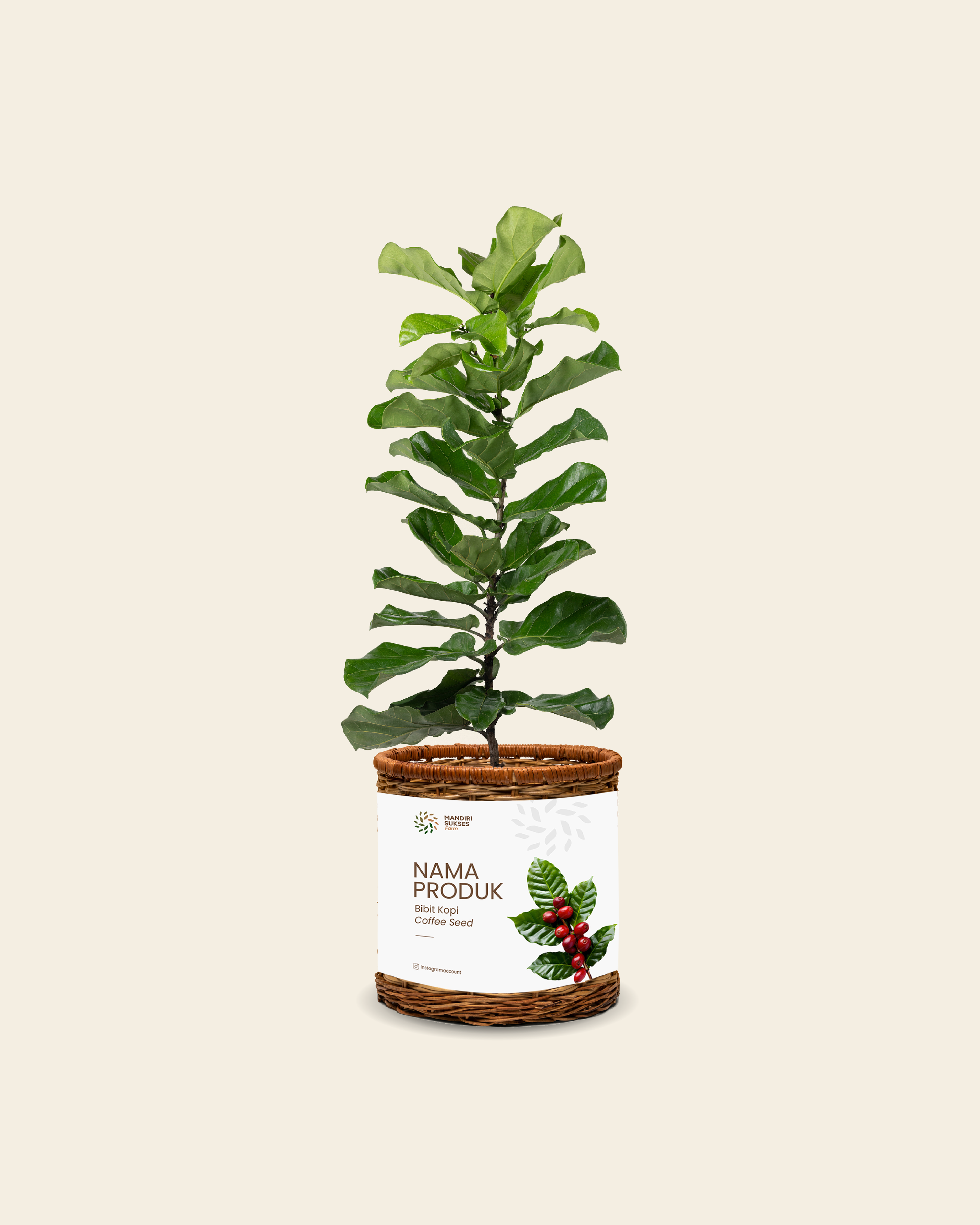
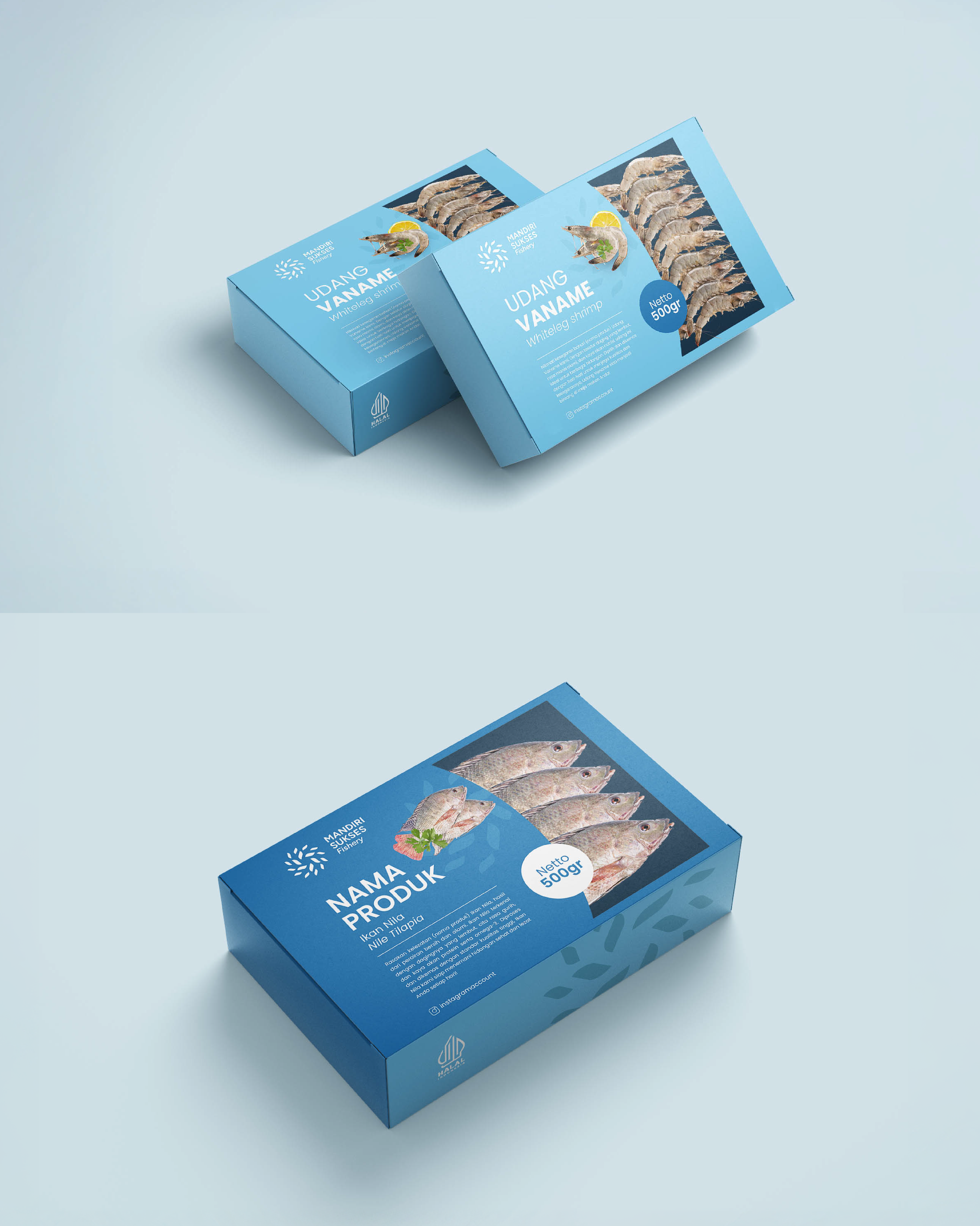
Our objective was to create a Flexible Brand Architecture that could unify diverse product lines (Seafood vs. Coffee) under one professional roof. We developed a "Derivative Logo System" where the core logotype remains consistent, but the visual cues shift based on the sector. For the Fishery Division, we utilized a Deep Ocean Blue palette to symbolize depth, freshness, and cold-chain reliability. The packaging for the frozen shrimp and fish features clean, transparent windows and aquatic motifs to highlight product integrity. For the Farm Division, the identity shifts to Soft Earth Greens, representing organic growth and nurturing. The packaging for the coffee seedlings uses breathable layouts and botanical illustrations to differentiate it from the industrial seafood line. The result is a corporate identity that feels cohesive yet functionally distinct across different market shelves.

credits
Client — Mandiri Sukses Group
Brand Identity — Circa Creatia
Teams — Nuriana Sekarlintang, Riza Fauzia, Cita Filda, Achmad Rifqy
Year — 2024