the brand
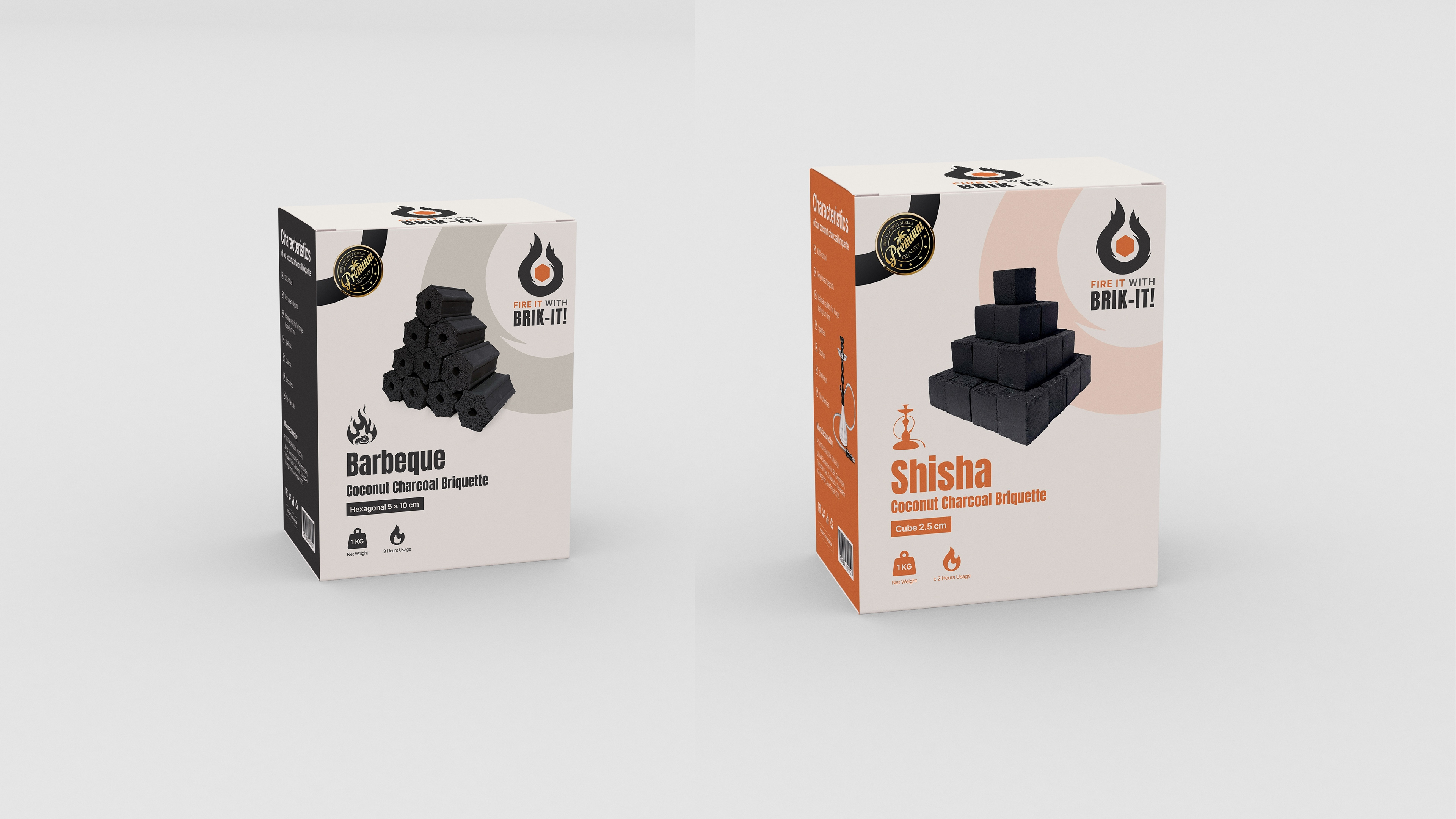
Brik-It! is a premium Coconut Charcoal Briquette brand designed for the modern grill master and shisha enthusiast. In a market saturated with generic, low-quality fuel options, Brik-It! positions itself as the "High-Performance" choice, promising high calorie heat, long burning times, and an odorless, chemical-free experience. With the tagline "Fire it with Brik-It!", the brand captures the excitement of ignition and the communal joy of a BBQ or hookah session. It targets a global audience (B2B export & premium retail) who value consistency and sustainability, ensuring that the fuel is as high-quality as the meat on the grill or the tobacco in the bowl.
the process
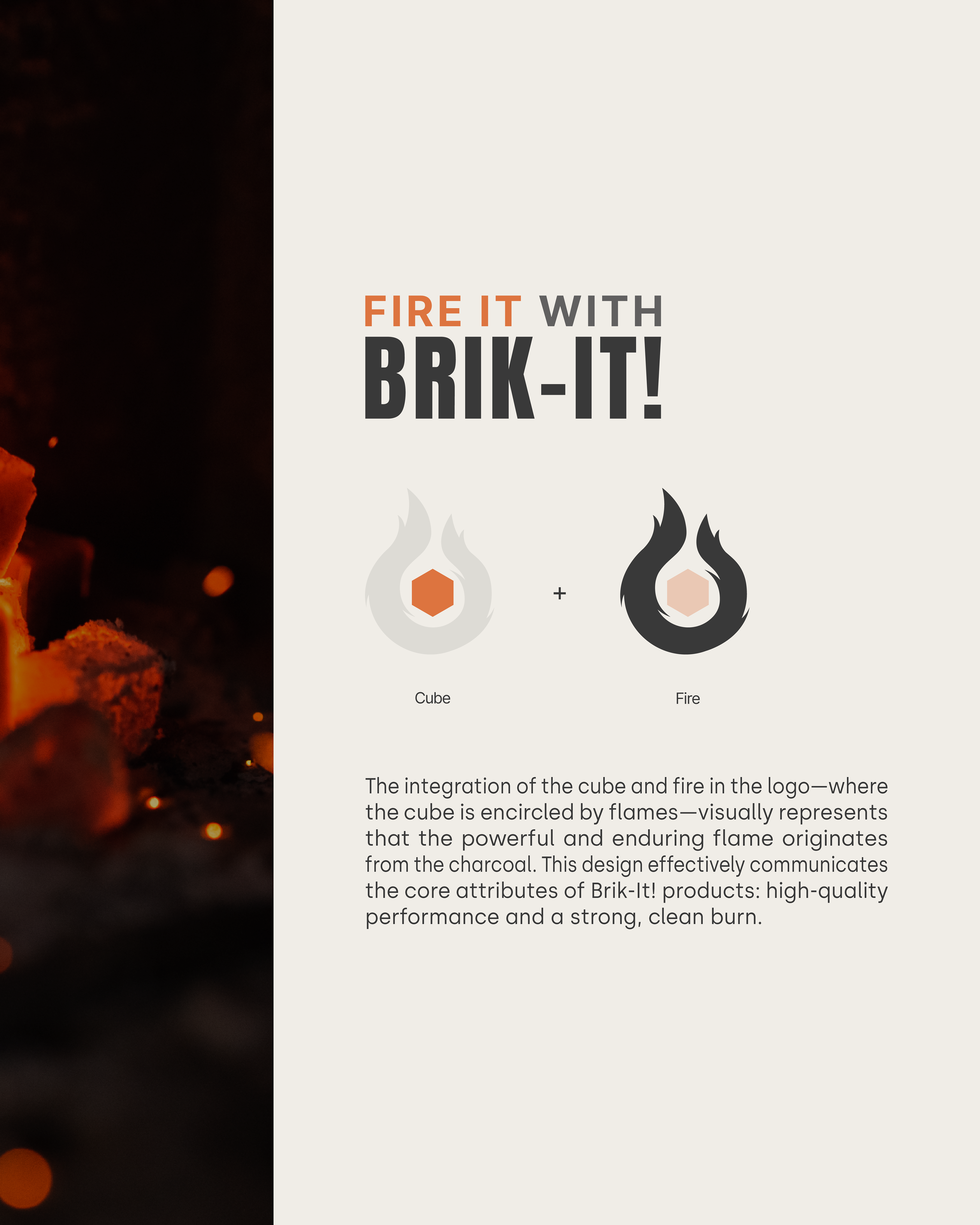
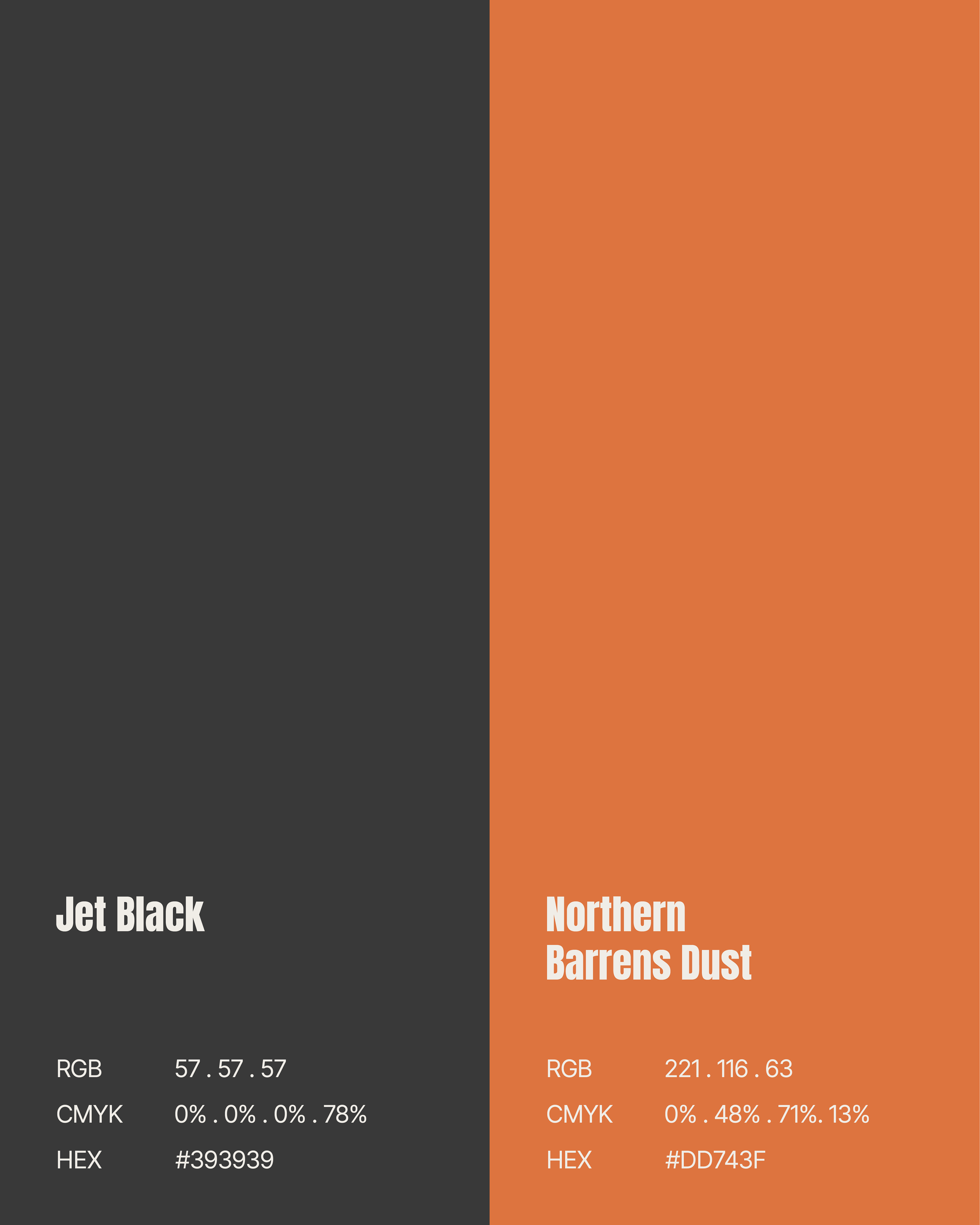
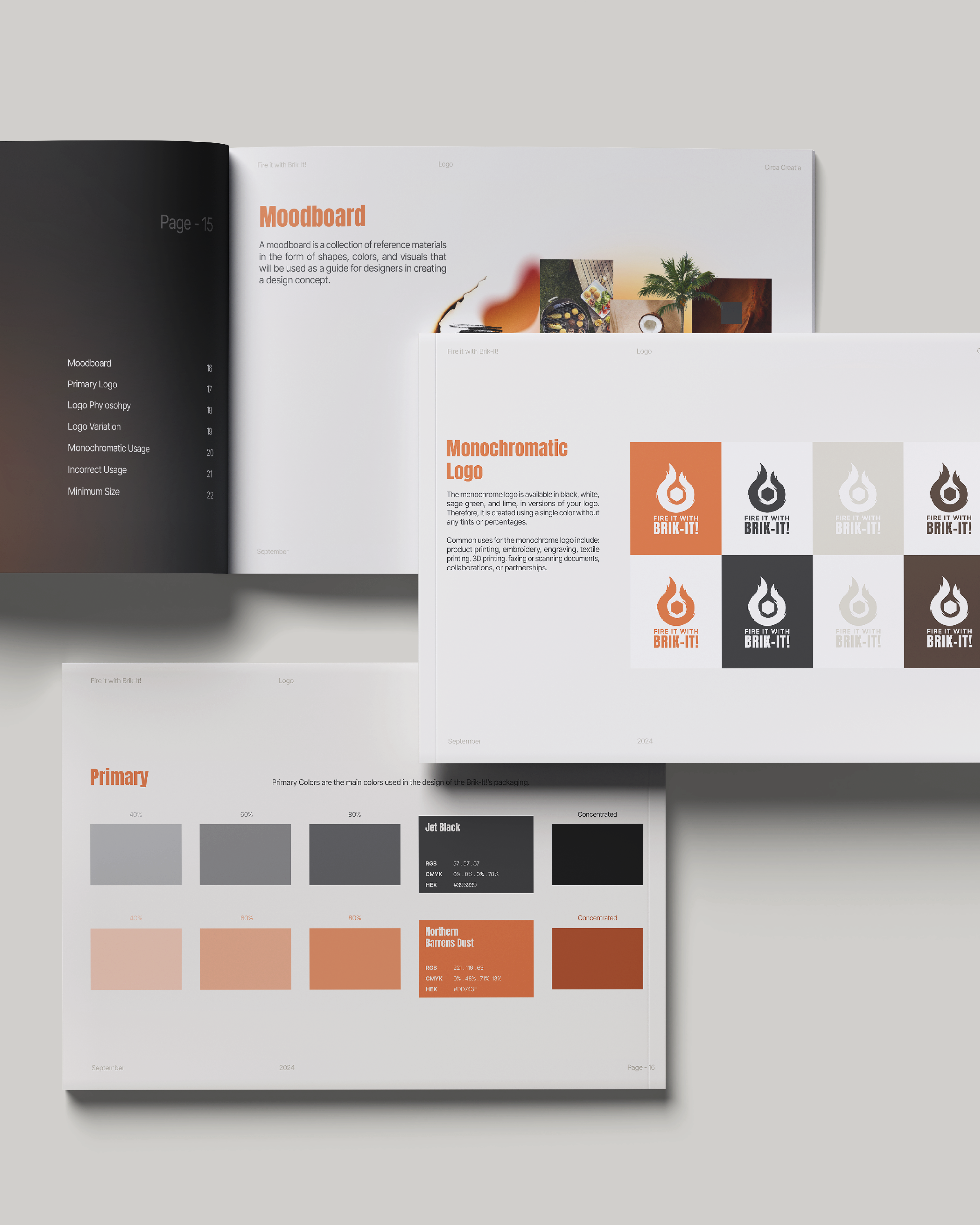
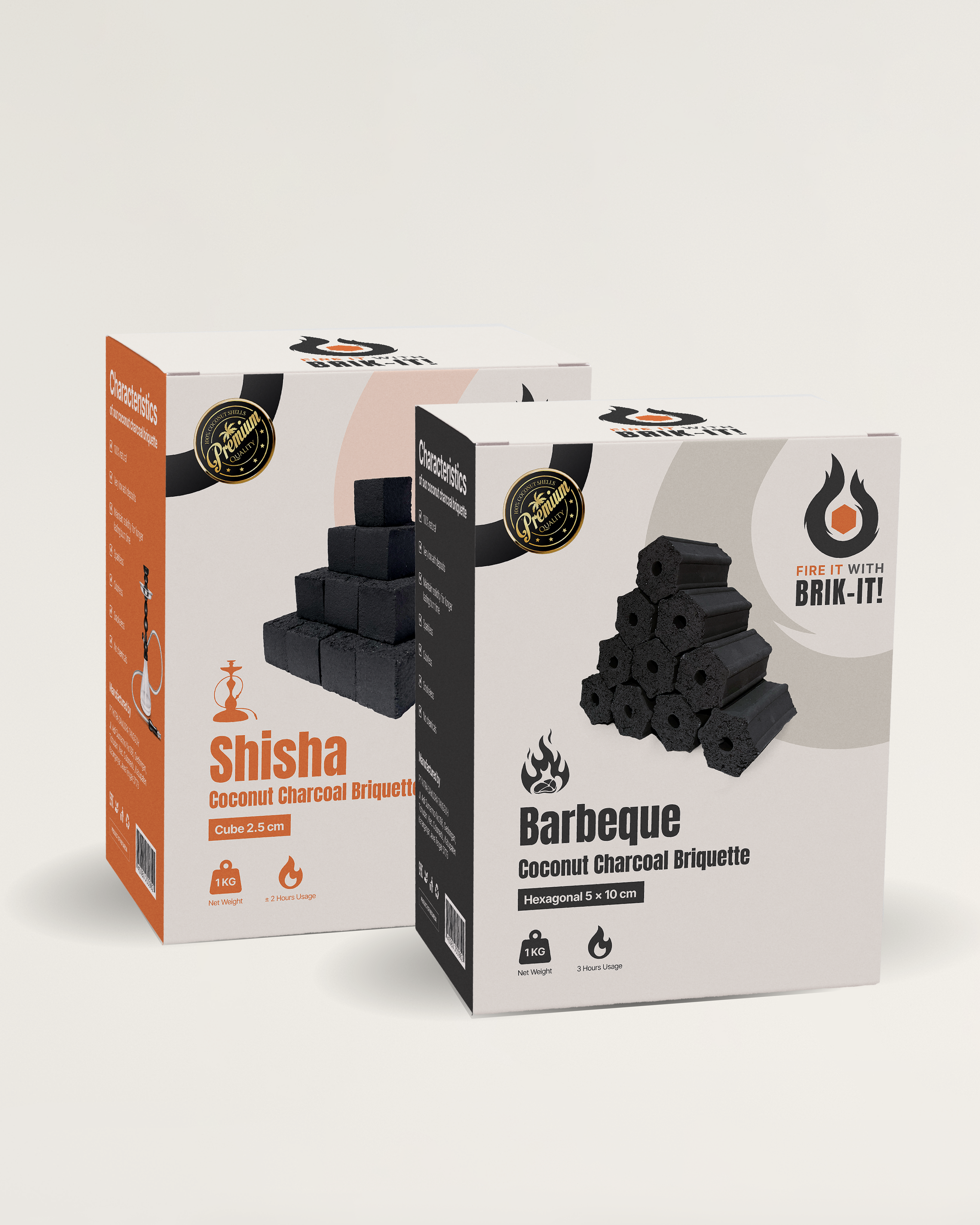
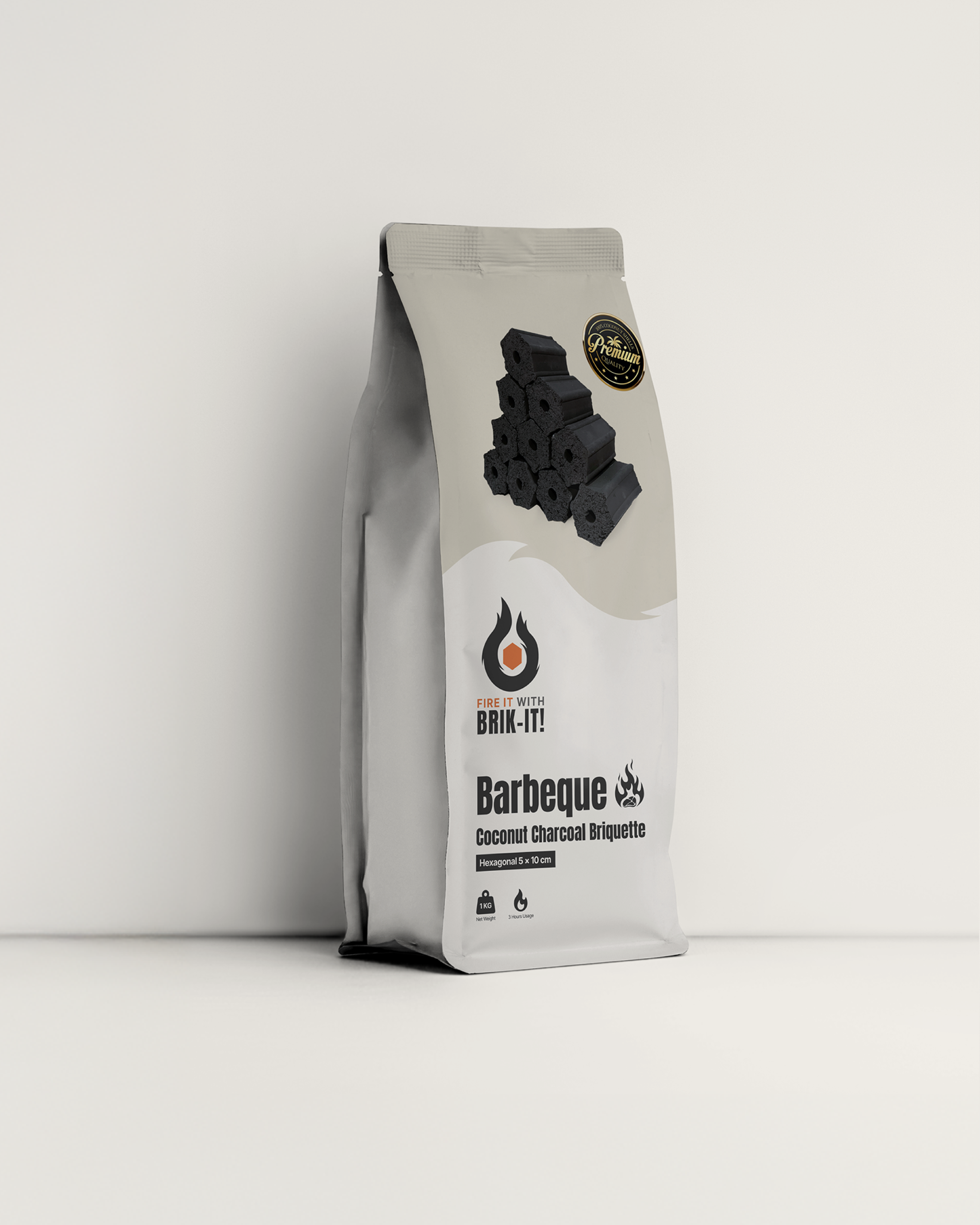
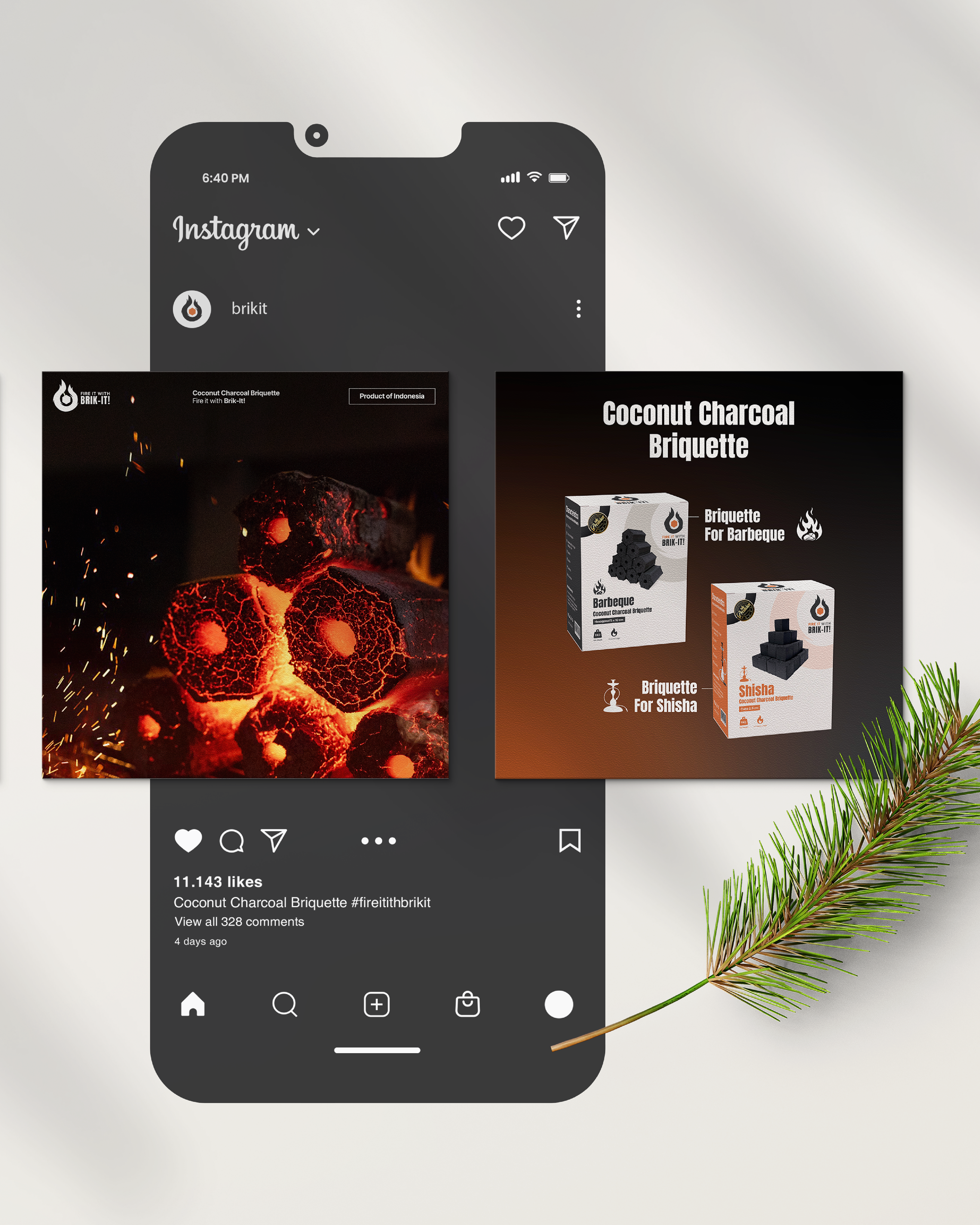
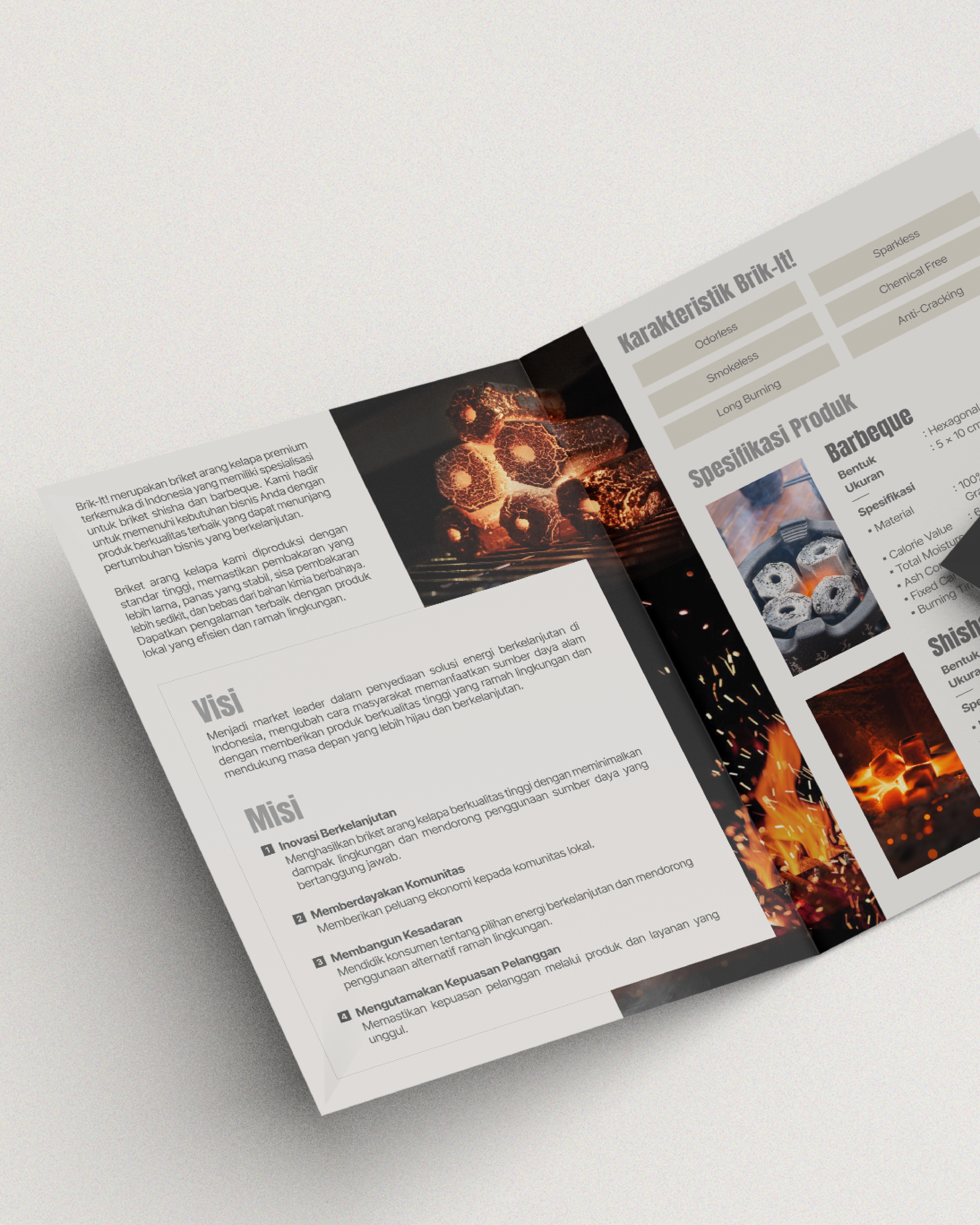
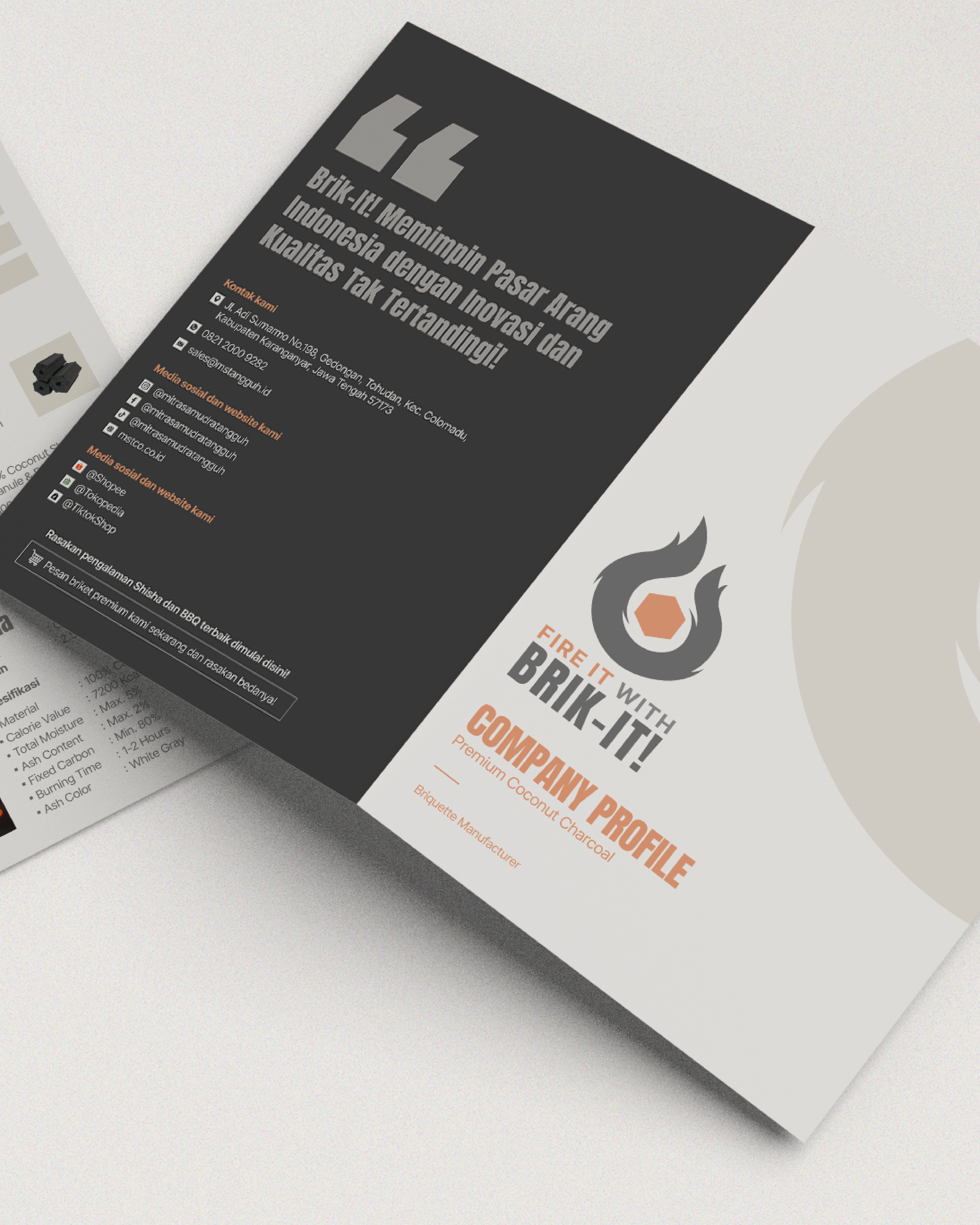
Our objective was to create a visual identity that felt "Hot" and "Dynamic" without relying on cliché flame clipart. We needed to visualize the energy of the product. The visual system is built on high contrast. We utilized a deep, matte Charcoal Black as the primary canvas to represent the raw material, pierced by vibrant Ember Oranges and Yellows to symbolize the ignition and heat. The typography is bold, sturdy, and industrial, reflecting the "Anti-Cracking" durability of the briquettes. We extended this identity into a packaging system that stands out on retail shelves, using clean geometry to signal "premium quality" amidst messy competitor bags. The social media assets focus on "The Glow", using dark-mode aesthetics to make the product look sleek, premium, and ready to burn.
credits
Client — Brik-It!
Brand Identity — Circa Creatia
Teams — Nuriana Sekarlintang, Nursita Sari, Riza Fauzia, Adeni Ali, Riski Kusniyanto
Year — 2024