
the brand
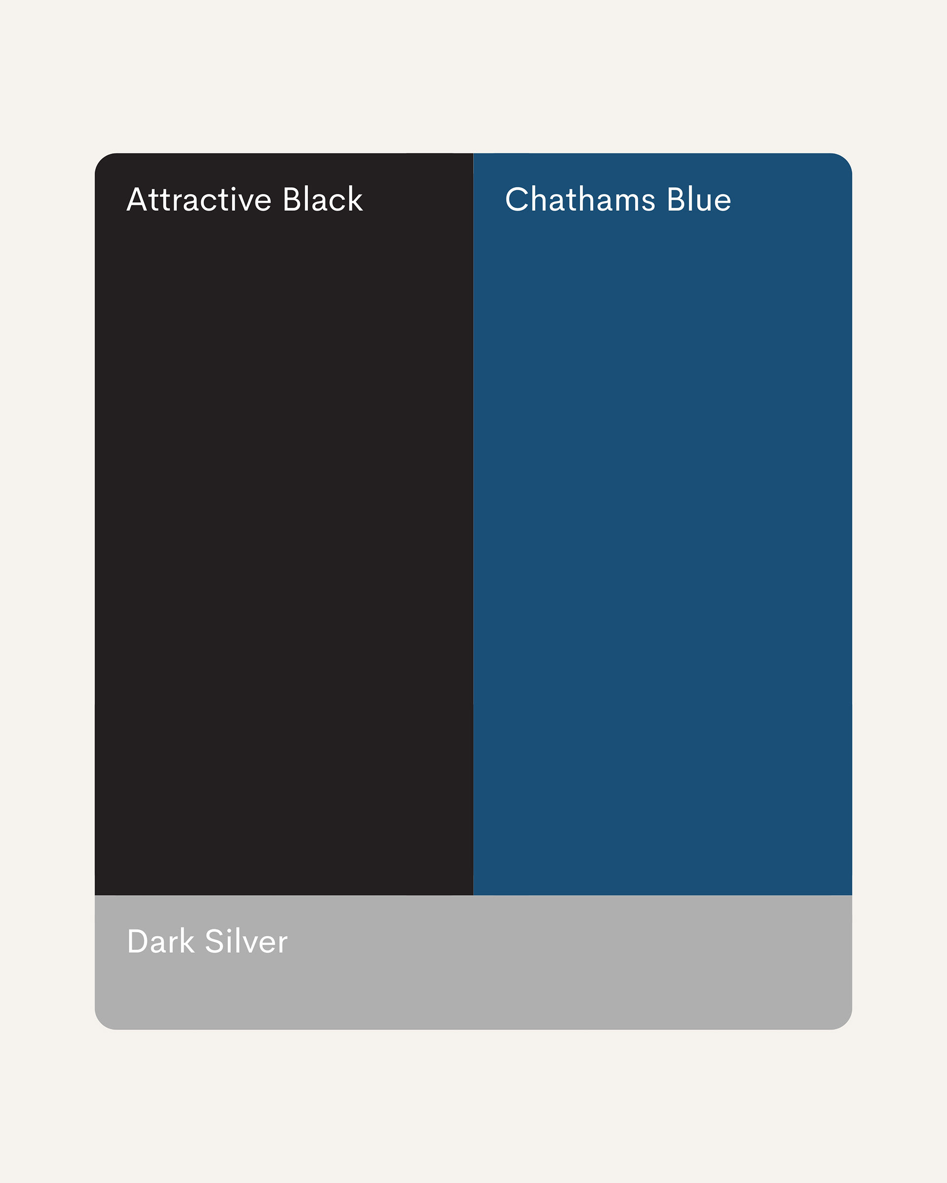
Blueprint Group is a professional services firm built on clarity, structure, and trust. In a landscape of complexity, Blueprint cuts through the noise with straightforward solutions and reliable expertise. Blueprint positions itself as the steady hand in strategic planning, the partner who translates vision into actionable blueprints. Their visual language reflects this philosophy: bold, confident, and designed to last. Attractive Black commands authority. Chatham's Blue adds depth and trustworthiness. Dark Silver grounds everything in professionalism. This is a brand that builds foundations.
the process
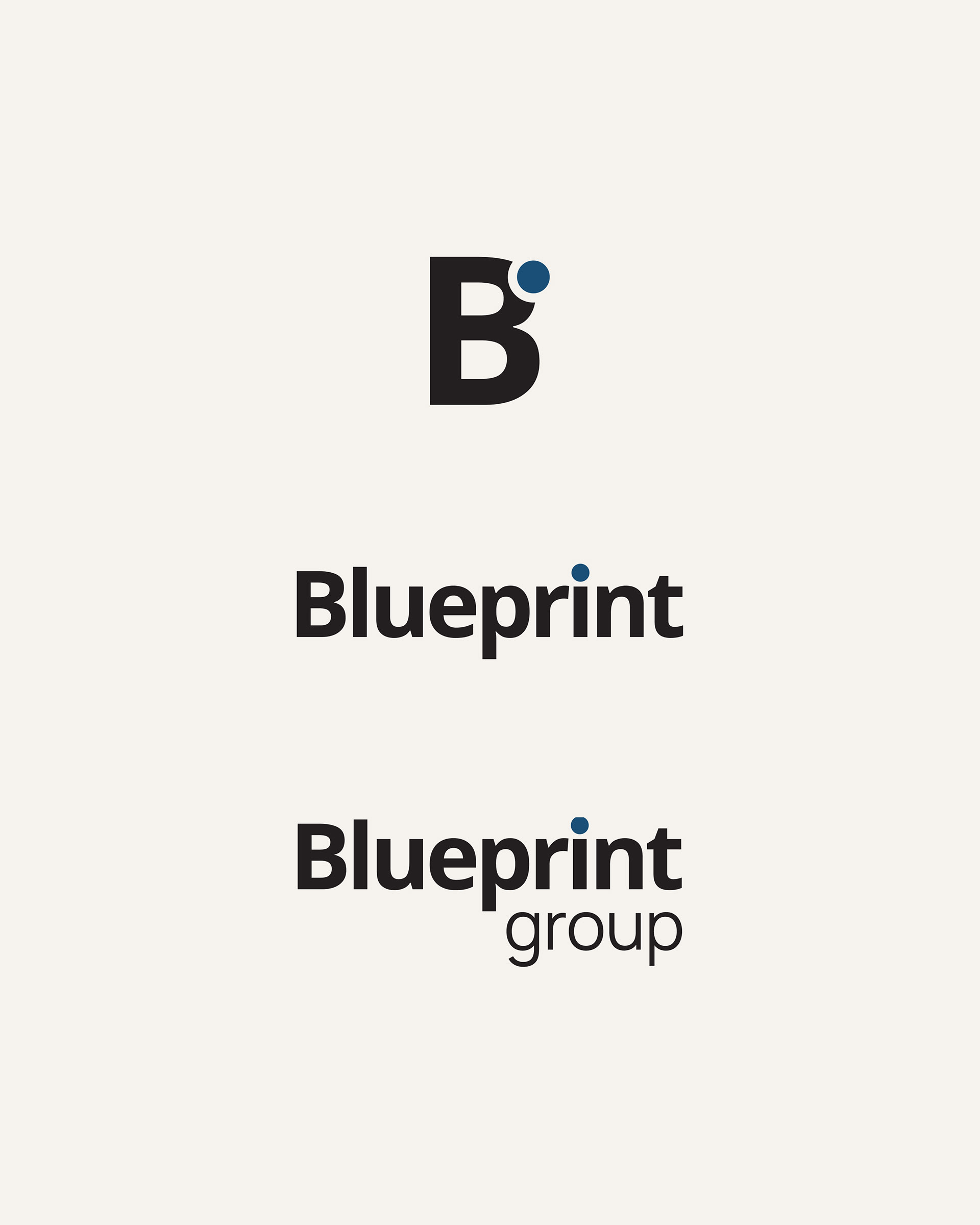
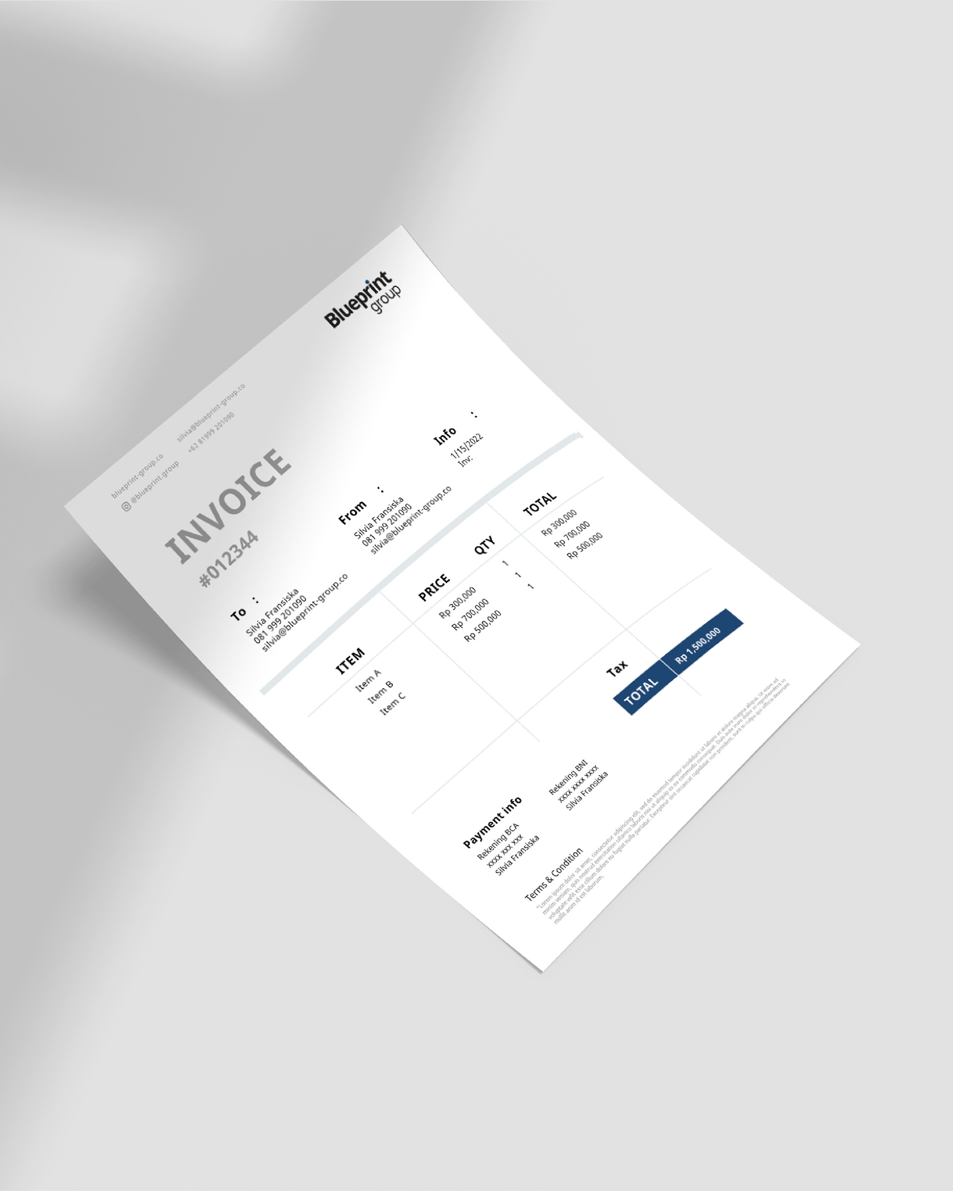
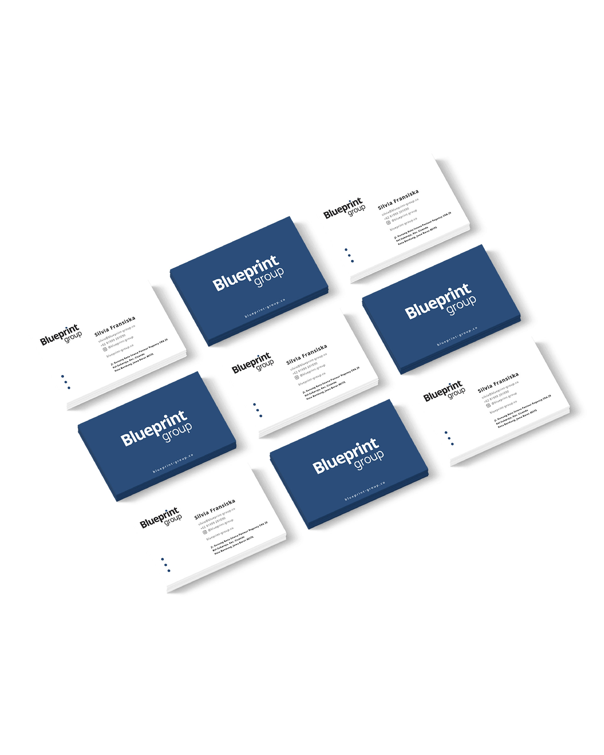
We created a comprehensive brand identity system that mirrors Blueprint's own approach: methodical, purposeful, and built to scale. At the core is a refined logotype paired with a signature dot accent that becomes a design element throughout the system. This simple geometric mark serves as a visual anchor, appearing in business cards, letterheads, and digital applications.
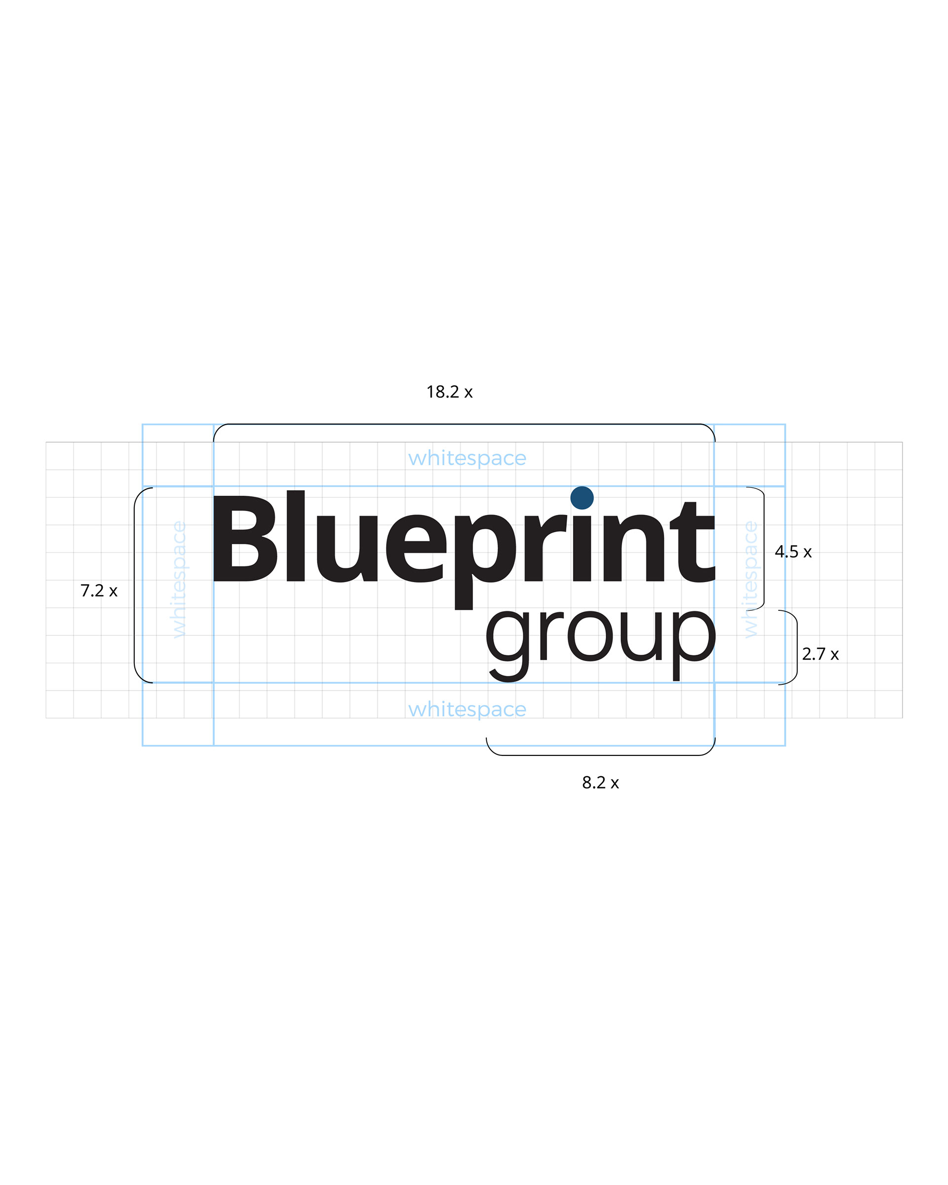
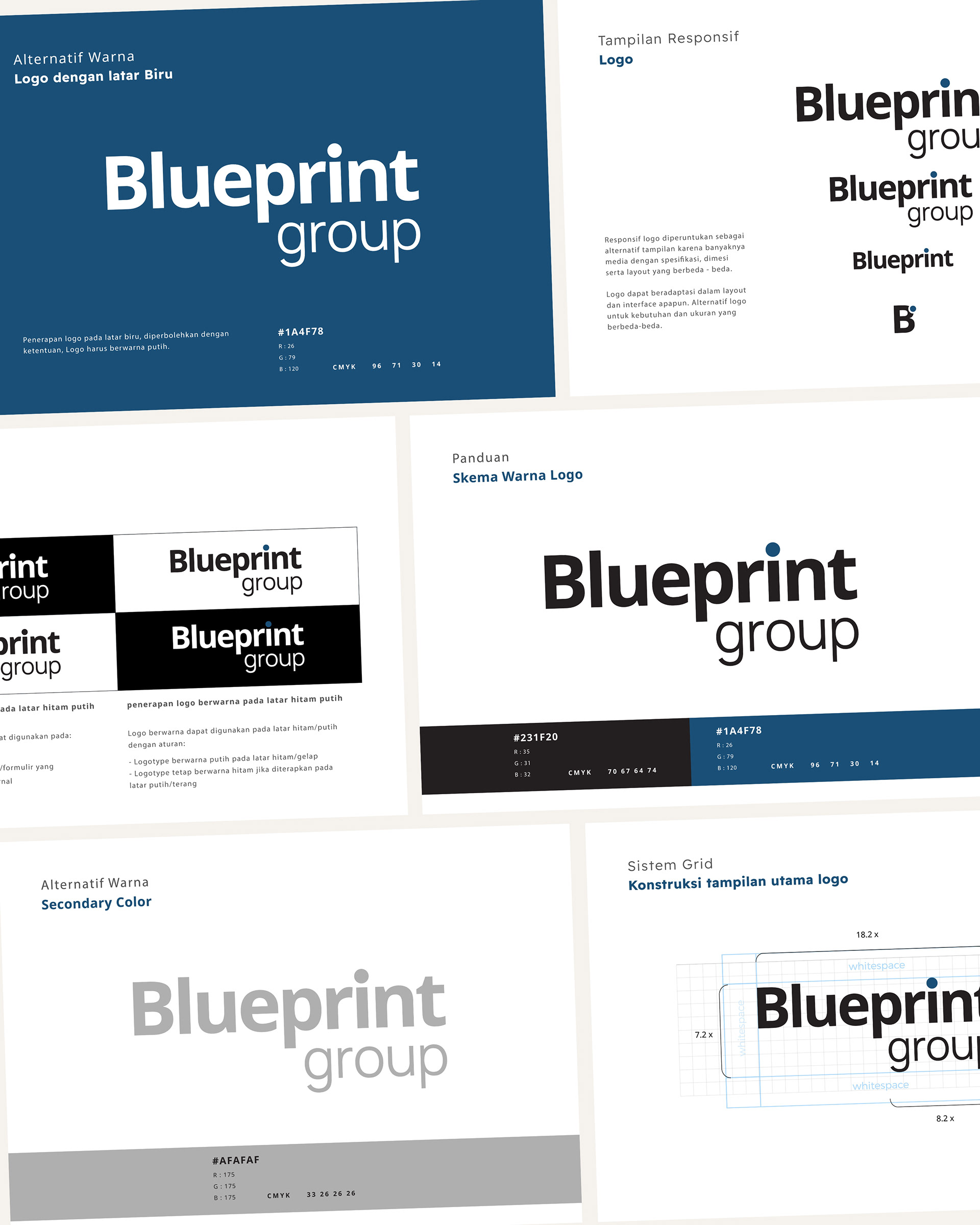
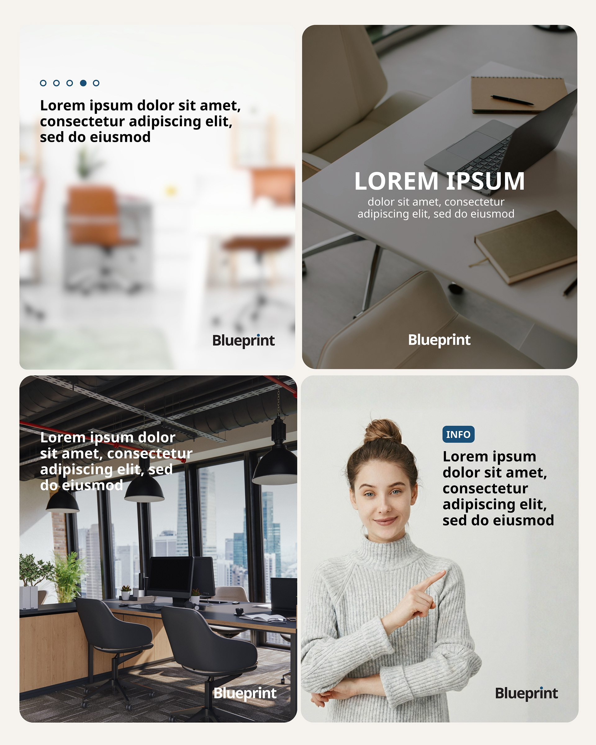
We developed a complete brand ecosystem: a color palette that works in print and digital, a carefully considered typographic hierarchy, clear spacing systems, and application guidelines that ensure consistency across touch points. From business cards to invoices, from presentations to websites, every application reinforces Blueprint's core message: structure, reliability, and professional excellence.
The result is a brand system that's both timeless and contemporary, one that grows with the business while maintaining its foundational integrity.
credits
Client — Blueprint Group
Brand Identity — Circa Creatia
Teams — Nuriana Sekarlintang, Dimas Raviandra
Year — 2022